The information presented within this blog is aimed at website owners seeking to learn the ropes of web accessibility. Technical elements are described in layman’s terms, and, as a rule, all topics pertaining to the legalities of web accessibility are presented in as simplified a manner as possible. This guide has no legal bearing, and cannot be relied on in the case of litigation.
The foundational element of each Shopify website is its theme.
These allow you to present potential customers with a stimulating online store, and ensure an intuitive, easy shopping and browsing experience.
But what about accessibility?
Which themes should you choose in your efforts to create an accessible website?
In this blog, we’ll explore some of the more accessible Shopify themes available on Shopify’s theme store, as well as on theme-building directories. We’ll highlight the themes you should gravivate toward in your efforts to conform to the Web Content Accessibility Guidelines (WCAG), and offer ways in which you can solve the accessibility issues found even in the most accessible of themes.
Important note: There is no such thing as a fully accessible Shopify theme. To fully conform with WCAG and ensure your Shopify website is fully accessible, you will need to address the accessibility issues native to Shopify themes. Many Shopify store owners rely on accessibility apps, like accessWidget, to remediate accessibility issues appearing within Shopify themes.
What Shopify themes should you consider to create an accessible website?
So, after that long (yet necessary intro) let’s get down to what we’re all here for:
What Shopify themes should you be looking at when creating an accessible Shopify website?
Before you is a list of some of the most accessible themes out there.
However, as mentioned numerous times throughout this blog, even the most accessible Shopify theme still has issues that prevent it from reaching full WCAG Level AA conformance. Therefore, we will highlight the strongpoints of each theme, while, at them same time, point to the accessibility issues you will need to address if you choose it.
To that end, you can rely on expert service providers, such as accessServices, and on designated accessibility apps, like accessWidget. We will explain this in further detail later in the blog. You can skip straight to that section by pressing here.
For your convenience, we’ve split the themes into two categories:
You can press on 'Paid themes' to skip straight to that section.
Free Themes:
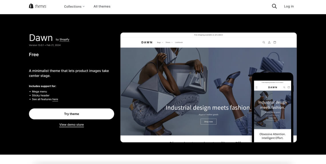
1. Dawn

The Dawn theme is Shopify's go-to theme for optimal performance, flexibility, and ease of use. It leverages Shopify's Online Store 2.0 features, enabling extensive customization and efficiency through minimal JavaScript usage and mobile-first design. Dawn is aimed at merchants seeking a sleek, modern online store that is built with best practices in mind.
What are some of Dawn’s accessibility strongpoints?
- Structured content sequencing: Ensures content follows a logical top-to-bottom, left-to-right sequence, aiding in comprehension for screen readers and assistive technologies
- Sensory characteristics: Content does not rely solely on sensory attributes like shape, size, or sound, making information accessible through multiple senses
What are some of Dawn’s accessibility issues?
- Low contrast in navigation: Links in the menu and the banner on the home page display insufficient contrast against their backgrounds, making them difficult to read for users with vision impairments. You will need to address this if you select this theme
- Non-descriptive label for locale control: The label for the control in the footer that changes the country and currency lacks descriptive information, making it unclear for users, especially those using screen readers
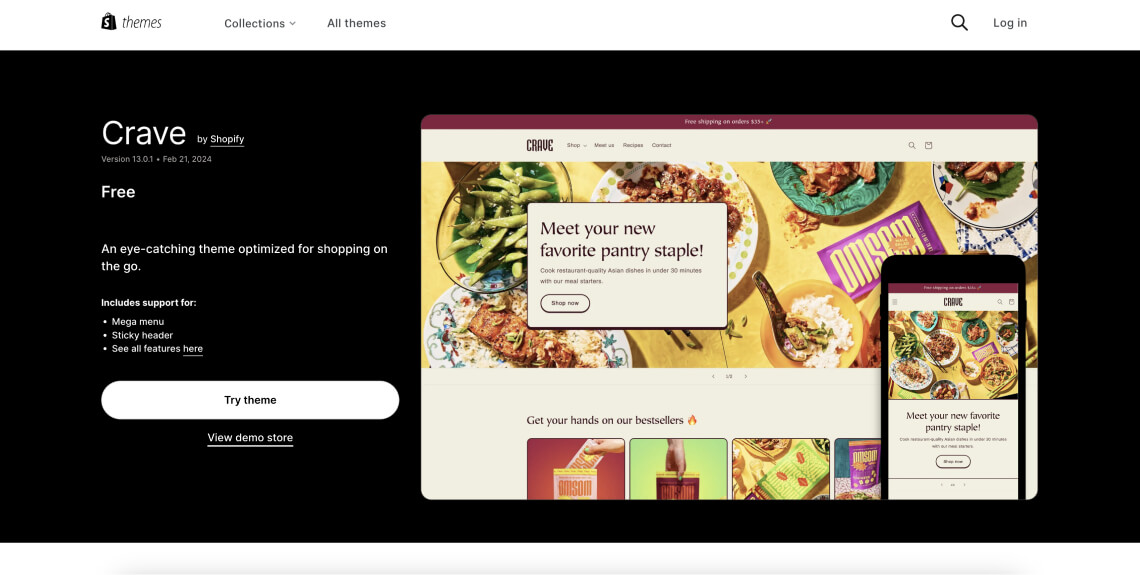
2. Crave

The Crave theme is a free Shopify theme tailored specifically for food and beverage stores. However, it is versatile enough to suit a range of other business types. It features mobile-optimized layouts and dynamic checkout options, making it appealing for customers using various devices including tablets and smartphones.
What are some of Crave’s accessibility strongpoints?
- Crave is a highly-customizable theme. You can select the proper color contrasts between text and its background (which should be at least 4.5:1) and headings and their background (which should be at least 3:1)
- As a fairly simple theme, you can fairly easily create a clear and intuitive navigation bar
What are some of Crave’s accessibility issues?
- The main logo link image does not have valid alt text instead of the text in the logo image. You will need to address this
- Offscreen products in Products page that appear when hovered over with a mouse are not hidden from assistive technology the way they should be. This can confuse screen-reader users
- The quoted testimonials positioned at the bottom of the theme are not contained in a <blockquote> element. This prevents screen-reader users from properly understanding them
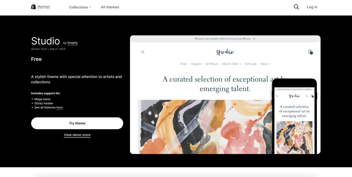
3. Studio

The Studio theme is a free Shopify theme designed primarily for small to medium-sized businesses. It boasts a sleek, modern design with a focus on large images and brand storytelling. It's particularly suitable for stores that want to showcase their products in a visually impactful way.
What are some of Studio’s accessibility strongpoints?
- Keyboard Navigation Compatible: Users can navigate through the theme using keyboard controls, which is critical for those unable to use a mouse
- Text resizing: The theme supports text resizing without breaking the page layout, ensuring that users with vision impairments can read the content easily
What are some of Studio’s accessibility issues?
- Improper use of HTML tags: The logo link in the header of every page is created using a h1 (heading level 1) tag, which could mislead screen readers and negatively affect SEO
- Announcement issues: Price and description are not announced by assistive technologies when tabbing through products, making it difficult for users relying on screen readers to understand product information
- Visibility of offscreen products: Offscreen products on the Home page that appear while hovered over with a mouse are not hidden from assistive technology, potentially confusing screen-reader users
- Alt text repetition: Product image alt text repeats the name of each product by default, without providing a visual description. You will need to be aware of this when using this theme
- Ambiguous link text: The ‘Read More’ link has ambiguous text that does not describe the destination of the link, which can be confusing for screen-reader users. You will need to change the link text so that screen reader users can properly navigate your Shopify store
- Low contrast: Borders around email input fields have insufficient contrast, making them difficult to locate for users with vision impairments
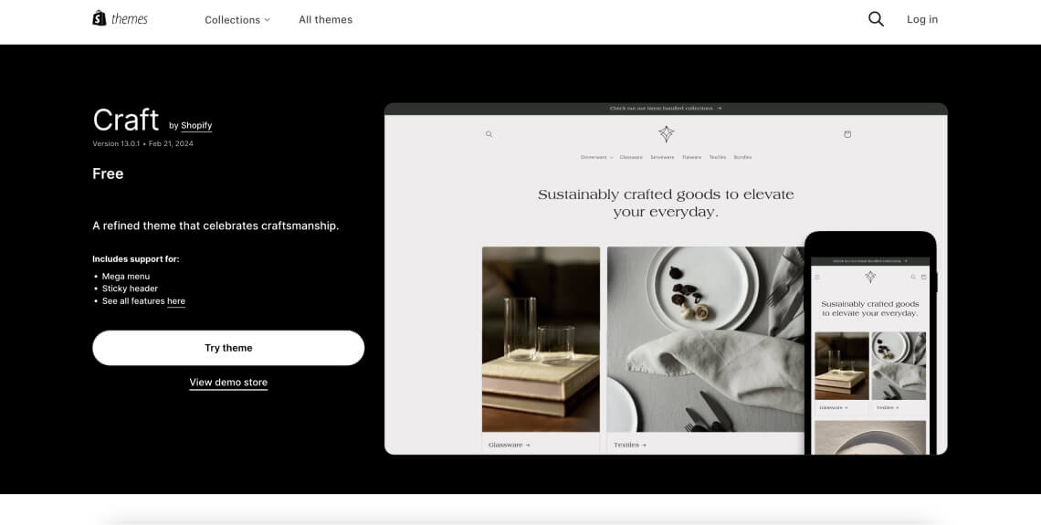
4. Craft

The Craft theme is a free Shopify theme that emphasizes a clean, minimalist aesthetic, ideal for artisanal stores, handmade goods, and creative merchandise. Its design promotes clarity and simplicity, allowing products to stand out.
What are some of Craft’s accessibility strongpoints?
- Minimalist design: Craft’s minimalist design reduces visual clutter, which can help users, especially those with cognitive disabilities, navigate the site more easily
- Mobile-responsive: This theme adjusts well to different screen sizes, improving accessibility for users on various devices
What are some of Craft’s accessibility issues?
- Improper use of HTML tags: The logo link in the header of every page is created using an h1 (heading level 1) tag, which could mislead screen readers and affect your online store from an SEO perspective
- Non-compliant filter controls: The filter controls aren’t built according to HTML and WAI-ARIA specifications, which can make the shopping experience challenging for screen reader users
- Inadequate input field design: The country/region selection input is not created as a combobox, reducing the usability for people using assistive technology
- Announcement issues: Product prices and descriptions are not announced by assistive technology when tabbed through, which could hinder the shopping experience for users relying on screen readers
- Ineffective alt text: Product image alt text either repeats the name of each product or provides a word preceded by a hashtag, failing to provide an adequate visual description for those with vision impairments
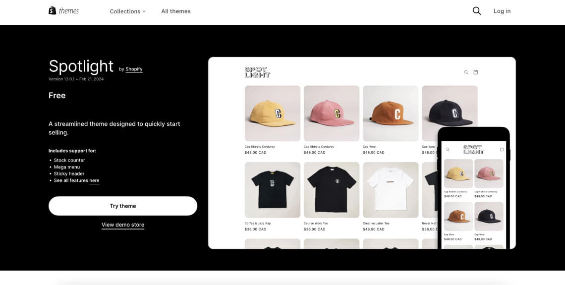
5. Spotlight

The Spotlight theme is a free Shopify theme, ideal for showcasing photography and products with high-resolution imagery. It’s designed to put your products under the "spotlight" and is especially suitable for stores with visually striking products.
What are some of Spotlight’s accessibility strongpoints?
- High-resolution display: Spotlight supports high-resolution images, which can help in presenting clear and detailed product visuals
- Responsive design: Spotlight adapts well to various screen sizes, offering a better browsing experience for users on different devices
What are some of Spotlight’s accessibility issues?
- Improper use of HTML tags: The logo link in the header of every page is created using a h1 (heading level 1) tag, which could mislead screen readers and impact SEO performance
- Non-accessible filter controls: The filter controls aren’t built according to HTML and WAI-ARIA specifications, which can hinder usability for individuals using screen readers
- Inadequate input field design: The country/region selection input is not created as a combobox, which can affect the ease of use for people using assistive technologies
- Announcement issues: Price and description are not announced by assistive technology when tabbing through products, making it difficult for screen readers users to get product information
- Ineffective alt text: Product image alt text repeats the name of each product by default, without providing an adequate visual description
- Inconsistent interaction cues: The product image changes on hover but not on focus, which could confuse users who navigate primarily using the keyboard
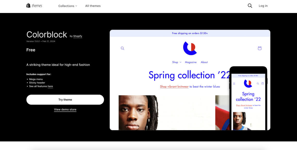
6. Colorblock

The Colorblock theme is a free Shopify theme known for its vibrant and colorful design, making it suitable for stores with lively products or those looking to make a bold statement. Its unique features are designed to attract and engage customers.
What are some of Colorblock’s accessibility strongpoints?
- Responsive layout: Colorblock adapts effectively across different devices, improving access for users on mobile or tablet
What are some of Colorblock’s accessibility issues?
- Improper use of HTML tags: The logo link in the header of every page is created using an h1 (heading level 1) tag, which will confuse screen readers and impact the site’s search engine optimization
- Illogical heading structure: The heading structure does not follow a logical order, which can make content difficult to navigate for screen reader users
- Problematic expandable menu items: Expandable menu items aren’t built according to HTML and WAI-ARIA specifications, which can affect their usability for people who rely on assistive technologies like screen readers
- Vague alt text: The alt text for collage images is too vague, which doesn’t provide sufficient context or description for those who rely on screen readers
Paid Themes:
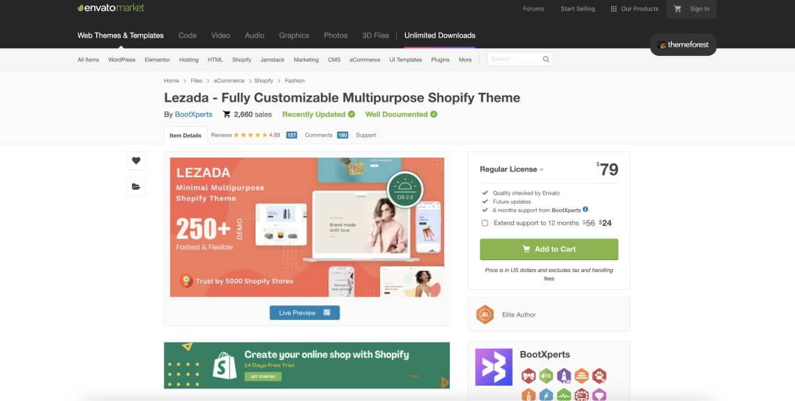
7. Lezada

Lezada is a premium Shopify theme that offers a wide range of features for multi-purpose stores. With its sleek and modern design, it caters to various retail categories, from fashion and beauty to electronics and home goods.
What are some of Lezada’s accessibility strongpoints?
- It is highly customizable: Allows for significant customization, enabling store owners to adjust layouts and elements to better serve their audience
What are some of Lezada’s accessibility issues?
- Invisible focus indicator: The focus indicator is not visible, which makes it highly challenging for users navigating the site via keyboard to know which element is being interacted with
- Limited keyboard navigation: Menu dropdowns and product customization options cannot be operated with a keyboard, hindering accessibility for non-mouse users
- Missing alternative text: Buttons and links that contain images do not have alternative text, making it difficult for screen-reader users to understand the function or purpose of these elements
- Low contrast links: Links in the header and footer have insufficient contrast against their backgrounds, making them difficult to read for users with vision impairments
- Improper use of HTML elements: Quoted testimonials are not contained in a <blockquote> element, which affects the understanding of screen-reader users as they are unable to identify the text as a quotation
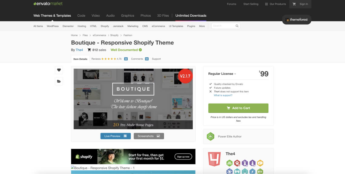
8. Boutique

The Boutique theme is a premium Shopify theme tailored for fashion and lifestyle brands. With its elegant and sophisticated design, it aims to provide an immersive shopping experience that highlights high-end products.
What are some of Boutique’s accessibility strongpoints?
- Responsive layout: Adapts effectively to various screen sizes, ensuring usability across different devices
- Detailed product showcases: The Boutique theme offers detailed product showcase options, including zoom-in functionality and high-resolution image galleries, to allow customers to view products in great detail
What are some of Boutique’s accessibility issues?
- Limited keyboard navigation: Menu dropdowns and product customization options cannot be operated with a keyboard, restricting access for individuals who do not use a mouse
- Invisible focus indicator: The focus indicator is not visible, making it difficult for keyboard users to determine which page element is currently selected
- Improper use of HTML tags: The logo link in the header of every page is created using an h1 (heading level 1) tag, which could mislead screen readers and impact search engine optimization
- Accessibility of credit card logos: Credit card logos are hidden from assistive technology, which can be problematic for users trying to understand payment options
- Missing alt attributes: Images within links of brand logos do not have alt attributes, leaving screen reader users without necessary contextual information
- Unlabeled brand logo links: Brand logo links are not labeled, which can confuse users about where the link will take them
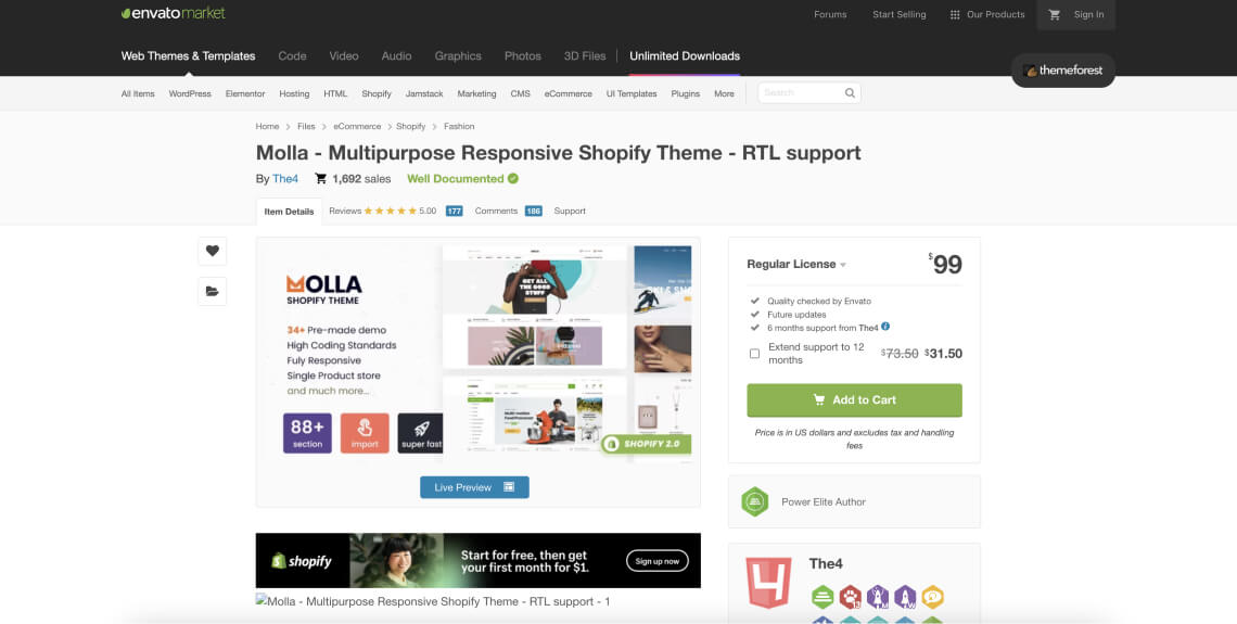
9. Molla

Molla is a premium Shopify theme noted for its versatility and high customization options, making it suitable for a wide range of industries. Its design is focused on enhancing user experience and showcasing products in the best light.
What are some of Molla’s accessibility strongpoints?
- High customization: Molla Offers extensive customization options, allowing for unique storefronts that can cater to specific brand identities
- Responsive design: The Molla theme is equipped with an adaptable design that adjusts seamlessly to fit various screen sizes, ensuring a consistent and user-friendly shopping experience on any device
What are some of Molla’s accessibility issues?
- Can’t be fully navigated exclusively via keyboard: Menu dropdowns and product customization options cannot be operated with a keyboard, which restricts accessibility for users who navigate using keyboard controls
- Invisible focus indicator: The focus indicator is not visible, making it difficult for those using keyboard navigation to track where they are on the page
- Unlabeled graphics: Links that contain graphics do not have adequate labels, making it challenging for users of screen readers to understand their function
- Repetitive aria-labels: Brand logo links use the same aria-label, which can cause confusion for users employing screen readers as they cannot distinguish between different brands
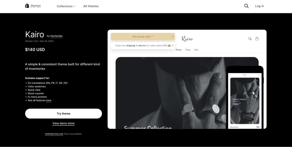
10. Kairo

Kairo is a Shopify theme designed for a broad array of businesses, known for its sleek design and focus on visuals. It's particularly suited for stores that want a modern and stylish online presence.
What are some of Kairo’s accessibility strongpoints?
- Intuitive navigation structure: Kairo facilitates easy browsing through clear categorization and a user-friendly layout, which can aid users in finding products quickly and efficiently
- Clear and concise labeling: Kairo utilizes clear labeling for interactive elements and informational sections, which can assist users in understanding website content and navigation mechanics
What are some of Kairo’s accessibility issues?
- Emojis without text alternatives: The emojis featured on the theme lack text alternatives, rendering this content inaccessible to screen reader users
- Flawed pagination controls: The same, misspelled text is used for all controls, which could confuse screen reader users
- Icon buttons without descriptions: Close buttons using icons (like “X”) lack proper text alternatives, excluding users who rely on screen readers
- Inconsistent alternative text for links: Alternative text does not consistently match the visible text, causing possible disorientation for those who rely on assistive technology
What makes a Shopify theme accessible?

An accessible theme is one that allows your Shopify theme to conform to the Web Content Accessibility Guidlines (WCAG). Established by the World Wide Web Consortium (W3C), WCAG is a lengthy document that includes numerous sections (or success criterion) your Shopify website should conform to.
As a whole, WCAG is based on four fundamental principles:
- Perceivable: Online shoppers need to be able to perceive content appearing on your Shopify website through their senses of sight, sound, and touch
- Operable: Online shopper need to be able to operate your Shopify store regardless of ability. An operable Shopify website needs to be navigable entirely by sight-assisted navigation, a keyboard, and other alternatives to a classic mouse
- Understandable: Your Shopify store needs to be easy to understand. It should be devoid of overly technical terms or complex jargon, as well as complicated instructions that are difficult to follow
- Robust: For your Shopify website to be robust, it needs to use HTML and CSS according to specifications, and be compatible with assistive tools
Throughout the last few decades, there have been a number of WCAG versions:
- WCAG 2.0
- WCAG 2.1
- WCAG 2.2
Each version of WCAG includes three levels to which your website can conform:
- Level A - the lowest level of conformance
- Level AA - the conformance level referenced in most accessibility laws and guidelines
- Level AAA - the optimal and most difficult level of conformance to achieve
It is highly recommended that your Shopify website conforms to WCAG 2.1 or WCAG 2.2 at Level AA.
What does conforming to WCAG 2.1 or 2.2 at Level AA entail?
Conforming to WCAG 2.1 or 2.2 at Level AA requires that your Shopify website meets specific criteria. These touch on a various technical and design-related aspects of your website. Some of the most prominent criteria include, but certainly aren’t limited to:
- Ensuring your Shopify store is compatible with screen reader technology
- Ensuring your Shopify store can be navigated entirely via keyboard
- Adding descriptive alt text to meaningful images (i.e., the kind that convey meaningful information)
- Ensuring your forms are structured and labeled properly
- Striking proper color contrasts between text and meaningful icons and their backgrounds
- Adding captions to meaningful video content
- Ensuring your Shopify site is responsive on all devices
- Ensuring that the online documents appearing within your website are accessible
In your efforts to create an accessible Shopify website, we highly recommend you check out our in-depth guide by pressing here.
A note on ADA compliance
It is worth noting that, as an online store owner, you are likely mandated by law to comply with the Americans with Disabilities Act (ADA). Many U.S. courts today apply ADA Title III (which defines ways in which businesses should cater to customers with disabilities) to the online domain. Therefore, to comply with the ADA, you must ensure that your website (along with your physical domain, if you have one) is accessible to people with disabilities.
U.S. courts often reference WCAG Level AA as the standard websites should conform to under the ADA. This is consistent with the Department of Justice’s stance, which was expressed an an official letter (and then reiterated in another official proclamation in 2022), referencing WCAG as the standard for compliance under the ADA.
Bottom line: As a Shopify website owner, you more than likely need to ensure your website conforms to WCAG under the ADA. You can read more about the ADA’s application to websites by pressing here.
What Shopify says about its own themes’ accessibility limitations
More so than a lot of other CMSs and website-building platforms, Shopify places a heavy premium on accessibility. This is particularly evident in the fact that, for a new template to be admitted into Shopify’s Theme Store, it must be accessible. Those interested in creating a template that meets Shopify’s accessibility standards, will need to apply ARIA labels, roles, and attributes to a variety of elements, most notably the to the navigation menu and online forms. ARIA is a more technical aspect of web accessibility that you can read about here.
However, all the same, there isn’t one theme that Shopify can confidently point to as one that conforms to WCAG 2.0, 2.1, or 2.2 at an AA level.
It is worth noting that, by Shopify's own admission, ‘Shopify's free OS 2.0 themes (including the Dawn theme), paired with Checkout, are Shopify's most accessible themes, and those most likely to be ADA-compliant.’
At the same time, Shopify sets the responsibility of reaching full accessibility status (and ADA compliance) squarely on its costumers’ shoulders. In its own words: ‘It is your responsibility (as the online store owner) to ensure that your storefront complies with all applicable laws and regulations in the your jurisdiction and in the jurisdiction of each of your customers, including all laws and regulations which relate to web accessibility.’
Finding a solution for Shopify’s ‘accessible’ themes’ accessibility issues

The question that you must be asking at this point is pretty clear:
If you select an accessible Shopify theme but your online store still isn’t fully accessible and WCAG-conformant, what should you do?
Well, there are a few options:
1. You can turn toward a web accessibility expert service provider: Experts such as accessServices, can audit your Shopify website, and identify problematic areas existing within your chosen theme. Then, they can apply the necessary changes and tweaks to ensure that it is accessible
2. You can use a Shopify accessibility app: apps such as accessWidget run an automated audit of your Shopify store’s code (obviously including your chosen theme). Once it identifies the accessibility issues existing within it, accessWidget will automatically implement the necessary changes so that your website reaches full WCAG 2.1. Level AA conformance.
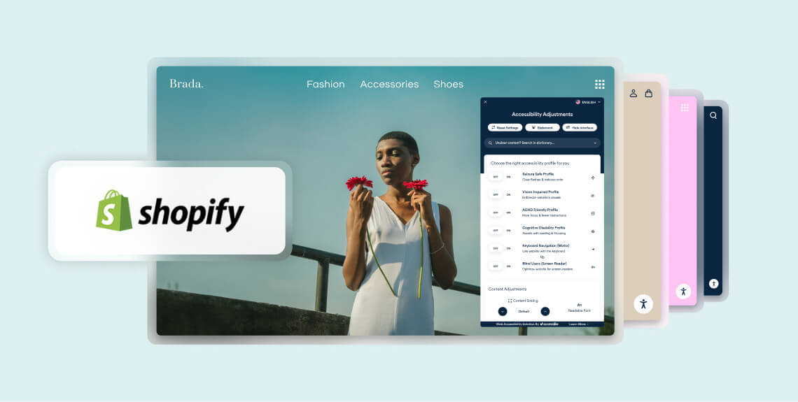
Another cool thing you get with accessWidget is a dynamic user interface your shoppers can use to adjust your online store to fit their unique abilities. Website visitors can adjust color contrasts, increase and decrease font sizes (and even change font families), halt animations, and enable read-only mode
You can read more about accessiBe's Shopify accessibility app and how it can help you solve the accessibility issues appearing in your Shopify theme by pressing here.
Closing thoughts
Creating an accessible Shopify website makes a ton of sense for a variety of reasons. It’s also simply the right thing to do. As your choice of theme will obviously have a major impact on its accessibility status, you need to pay special attention to the accessibility issues appearing within it.
Even the most accessible Shopify theme will not conform to WCAG to the fullest extent.
You will therefore need to ensure these accessibility issues are identified and fixed. One option is to turn to web accessibility experts, like accessServices, to identify and remediate the accessibility issues plaguing your theme. Another is to use a Shopify accessibility app, like accessWidget.
