ADA compliance and web accessibility: an overview
The Americans with Disabilities Act (ADA) exists to ensure that people with disabilities have the same rights and opportunities as everyone else. The section of the ADA that applies to web accessibility is ADA Title III.
Under ADA Title III, businesses that are considered “public accommodations,” such as banks, public transportation, real estate agencies, restaurants, and many small businesses, need to ensure that their websites are accessible to people with disabilities.
Effectively, however, almost all places of business provide services and accommodations to the public. Therefore, ensuring their websites and online documents are ADA-compliant is relevant to almost all businesses.
WCAG and accessible fonts
Websites are generally viewed as ADA-compliant if they conform to the Web Content Accessibility Guidelines (WCAG). Created by the World Wide Web Consortium (W3C), WCAG is considered by many to be the most important protocol shaping global web accessibility policy.
WCAG includes a number of sections that apply to content visibility and design. These can help website owners and designers choose fonts that are most accessible to people with disabilities.
The most important WCAG sections that apply to fonts are:
- Web content should be presented in different ways: When applied to fonts, it is important to select one that is easy to read when resized or presented with different styling or spacing
- Web content should be easy to see or hear: To ensure content is easy to see, it’s important to consider a font's family, size, spacing, and color
We will expand on these principles and explain how they translate to specific font styles and families later in the blog. To skip that section, you can click here.
It’s important to note that WCAG applies not only to websites, but to a variety of web-based applications, including online documents (e.g., PDFs), emails, and videos. These assets will need to feature accessible fonts, as well.
To help you in your efforts to achieve ADA compliance, you might also want to check out our ADA website compliance checklist.
The importance of using accessible fonts
Using accessible fonts within your website and other digital assets is critical for many people with disabilities, allowing them to properly access content. However, accessible fonts can also prove beneficial to other website visitors, as well.
Many people glance at text rather than read every individual word, especially when they’re distracted, stressed, or multitasking. To that end, a large, highly-readable font can prove very helpful.
Additionally, using highly-readable and accessible fonts can help your website rank in search engines. Fonts have a deciding impact on a website’s level of readability, and websites viewed by Google and other search engines as those that are highly readable tend to rank higher.
It is worth noting that web accessibility in general can bring about significant SEO benefits. You can read more about that in our guide on SEO and web accessibility.
Accessible fonts: a complete guide

Fonts that conform with WCAG (and are thus in compliance with the ADA) are defined by the following characteristics:
- They are simple and familiar
- They are composed of letters and characters that are easily distinguishable
- They exhibit sufficient size and weight to allow for comfortable reading
- They are composed of letters that do not mirror each other
- They have enough spacing between characters and lines
- They are not excessively decorative or italicized
- They contrast sufficiently with their background color
Let's dive deeper and examine how to select accessible font families, and how color and size impact font accessibility.
How to choose an accessible font family
Choosing an accessible font starts with choosing the right font family. This usually means choosing a font that isn’t italic, highly-decorative, or otherwise unusual.
Serif fonts contain decorative elements such as marks or lines at the end of a character's stroke. Conversely, sans-serif fonts do not contain decorative elements and are more block-like. This can make them slightly more readable.
That said, the traditional wisdom that serif fonts aren’t accessible is largely a myth. Both serif and sans-serif fonts can be accessible and inaccessible, and you should test specific font families for accessibility.
A key area you will want to examine is how easy it is to distinguish between certain number and letter pairings within a font family.
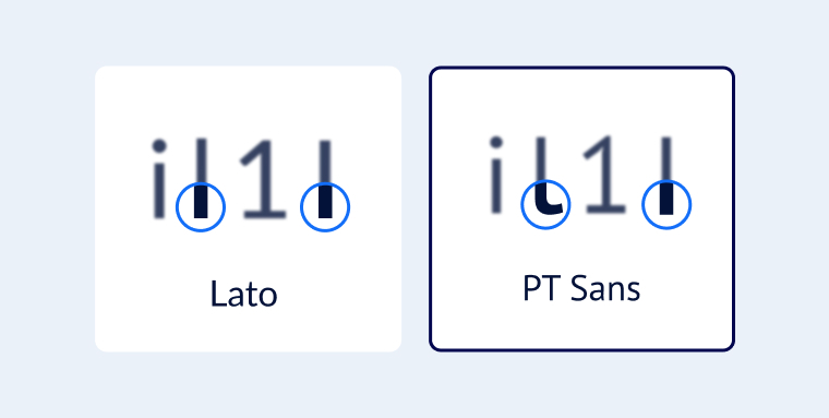
For example, some fonts can make it very difficult for readers to distinguish between the lowercase “i”, lowercase “l”, uppercase “L”, and numeral “1”. It's especially important to compare these characters with sans-serif fonts as the lack of flourishes can make them look very similar.
In the image below, the lowercase “l” and uppercase “I” appearing in the Lato font are indistinguishable. Conversely, the same characters appearing in the PT Sans font are distinguishable, thanks to the lowercase “l” swerving at the base.

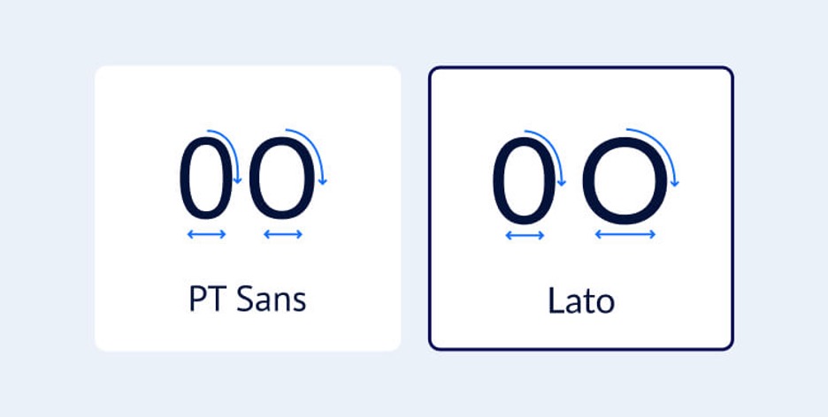
As another example, it can be difficult to distinguish between the numeral “0” and uppercase “O” when engaging with specific font families. In the image below, the "0" and "O" appearing in PT Sans are almost indistinguishable, while the same characters appearing in the Lato font are considerably different from each other.

Additionally, some people (specifically those with dyslexia and reading difficulties) struggle with “mirrored” typography. For instance, in certain fonts the lowercase letters “b” and “d” can look very similar when mirrored. It is therefore important to choose a font family in which these two letters are easily distinguishable.
Google advises checking the following character pairs within a font family to make sure they are sufficiently distinct from each other:
Size requirements for font accessibility
WCAG does not categorize specific font sizes as accessible. However, there are some accepted best practices that make text more readable for people with vision impairments. A safe bet for a WCAG-conforming font size is 16px (or 1em or 1rem) as the smallest size for body text. This is also the font size recommended by Google.
Here are some other best practices for font size and spacing:
Make headers easily-identifiable
Font size is crucial for readability, but it also helps people understand what content is important and what they can skim over. Readers will typically scan headings and headlines to find the information they’re looking for and understand the flow of the text.
To help readers understand the hierarchy of a page, use appropriate font sizes for different headings. For example, H2 headers should have a fixed font size that is larger than the one used for H3 headers.
Use sufficient text spacing
To make text readable, it’s important to think about text spacing. WCAG 2.1 (i.e., the current and most up-to-date version of these guidelines) includes the following requirements for text spacing:
- Line height should be at least 1.5 times the font size
- The spacing that follows paragraphs should be at least 2 times the font size
- Letter spacing should be at least 0.12 times the font size
- Word spacing should be at least 0.16 times the font size
Different font families vary in character width, which means that one font family can look more crowded compared to another even with the same level of spacing between words. To find the right spacing for a font, you can use the Google Fonts Type Tester.
Color contrast requirements for font accessibility
A font color is considered accessible when it contrasts sufficiently with its background. To that end, fonts should have a contrast ratio of at least 4.5:1 with their background.
For larger text (18pt or higher), it should be at least 3:1. If you want to conform to WCAG 2.1 Level AAA (i.e., the highest level of conformance with these guidelines) you will need to ensure a 7:1 contrast ratio between text and background. This will greatly benefit people with conditions such as color blindness.
Other areas you should address when it comes to font colors include, but aren’t limited to:
- Allowing website visitors to adjust font colors and other settings
- Changing the color of links that have been accessed
- Not using font color as the only visual means of conveying information
We recommend you read our guide on selecting ADA-compliant colors for a more in-depth breakdown of this topic.
Tips for choosing accessible fonts
To provide website visitors with an optimal user experience, you should use as few fonts as possible and optimize the readability of those you do choose.
Where possible, testing font choices on real customers or website visitors can be of great help, as they can give you feedback regarding their personal preferences. For example, if you know there are many people with dyslexia in your audience, you can research dyslexia-friendly fonts that are designed to make reading easier for them.
It is important to note that an estimated 20% of the world's population has dyslexia, the most common of all neuro-cognitive disorders. People with dyslexia heavily-depend on legible, highly-distinguishable fonts to access web-based content.
Dyslexie and Open-Dyslexic are two fonts designed specifically to make reading more enjoyable for those who have dyslexia. Here are links to their websites, where you can download these fonts and incorporate them in your website:
Additionally, providing website visitors with the ability to configure text size, color, line spacing, text style, and font family is a great way to serve their specific needs and preferences. There are solutions that can help you with this, such as accessWidget.
A web accessibility tool, accessWidget allows individual website visitors to modify design elements within your website to fit their abilities. These include adjusting font sizes, adjusting color contrasts so that fonts become more visible, and even replacing existing fonts with more readable ones.
Click here to read more about accessWidget and how it can help website visitors with disabilities.
Examples of accessible fonts

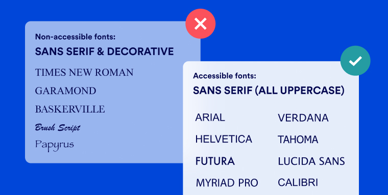
Many companies and designers want to choose a unique font for their website and other digital assets. That said, the most familiar fonts are usually popular for a reason. They tend to be the most readable, legible, and recognizable for readers. Some of the most popular accessible fonts are:
- Arial
- Calibri
- Century Gothic
- Helvetica
- Tahoma
- Verdana
As we mentioned before, there’s no right answer as to the most accessible font. Where possible, think about the unique priorities of your audience. For instance, your website visitors might value a larger font size or slightly more line spacing.
For the best results, conduct testing and gather feedback to find the best fonts for your audience. You can check out our list of beautiful ADA-compliant websites for inspiration. The websites featured on the list deftly leverage fonts such as Futura and Corporate S W07 to ensure optimal readability.
Fonts to avoid
You should generally avoid these fonts when designing for accessibility:
- Script fonts: Because script fonts emulate cursive handwriting, their letters are often not distinct from each other. This can cause difficulties for people with dyslexia, low vision, and some other disabilities
- Decorative fonts: Avoid fonts that prioritize decorative aesthetics over readability
- Thin or lightweight fonts: If a font is too thin or lightweight, it can be very difficult to read
Key takeaways
To fully-conform with WCAG and be ADA-compliant, your website, including the videos and online documents featured in it, will need to incorporate fonts that are highly accessible to all readers.
While choosing the correct font family is critical, you also need to pay attention to font size and color. By acting on the information appearing above, you will see to it that your website and online assets truly accommodate the disability community.
