The full list of accessible WooCommerce themes
Before you is a list of some of the more accessible WooCommerce themes available today.
It is important to note that just because a theme markets itself as accessible, that doesn’t necessarily mean it is.
In fact, we found that many of the supposedly accessible WooCommerce themes out there suffer from some fairly serious accessibility issues.
For that reason, we have divided this list into three categories:
- The most accessible themes we could find
- Themes with some accessibility issues
- Themes that have significant issues
You can press on each category to skip straight to it.
If you are planning to use a theme not on this list and want assurance that your online store is fully accessible, you will need to inspect the theme for potential accessibility issues. Note, however, that due to their complexity and to the high level of dynamic elements WooCommerce websites contain, they can be inaccessible even when your chosen theme has great accessibility.
Therefore, if you want to make sure your online shop fulfills accessibility standards, use a WordPress accessibility plugin like accessWidget.
accessWidget can automatically correct non-accessible code and provides visitors with disabilities with the option to adjust elements on your pages to suit their individual needs. We will discuss this in further detail later in the post. To skip straight to that section, press here.
Without further ado, here's the list:
Category one: The most accessible themes we could find
1. Storefront

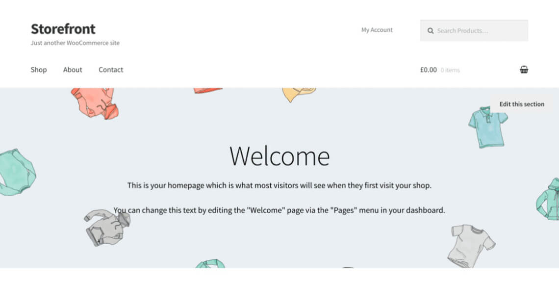
The first entry is the free default WooCommerce theme Storefront. It is made by the developers of the WooCommerce plugin itself and is active on more than 100,000 websites.
As should be expected, the theme integrates well with WooCommerce and its extensions. Storefront's default design is relatively plain and straightforward. It strongly focuses on displaying products with a white background and black text.
Accessibility strong points
- Clear design that has good default contrast and is easy to understand
- The theme comes with many options to customize colors (text, backgrounds, buttons, etc.) in order to ensure contrast and legibility
- It has several skip links, accessible drop-down menus, and good outlines for keyboard navigation
2. Neve

Neve already popped up on our list of accessible WordPress themes. It has more than 300,000 installs, making it one of the most popular themes in the WordPress directory, and is also suitable for WooCommerce. You can download it for free, but if you want to leverage its functionality to the fullest, you will need to opt for a paid license.
Accessibility strong points
- Neve comes with most HTML landmarks and roles
- Its contrast is good with clear colors, readable fonts, and sufficient spacing
- The theme offers many options to customize your site’s design, so you can ensure accessibility
- A skip-to-content link is available and you can open drop-down menus individually using just the keyboard
3. Responsive

Responsive is another free and popular entry among accessible WooCommerce themes. More than 30,000 websites use it as their theme of choice. It’s free to download in the WordPress directory but some functionality is only available with the paid version.
Accessibility strong points
- The them has a number of pre-set color schemes using proper contrast, but you can also create your own
- Skip links and good keyboard navigation options
4. OceanWP

600,000+ people trust OceanWP, a free theme, to power their websites and online shops. The theme is lightweight, fast, responsive, and comes with some unique features for WooCommerce stores.
Accessibility strong points
- OceanWP offers a skip-to-content link and keyboard-accessible drop-down menus
- Generally, the theme’s keyboard navigation is quite good (except for the point below)
Accessibility shortcomings
- The focus outline could be more prominent
- Some text contrast does not meet the specified threshold
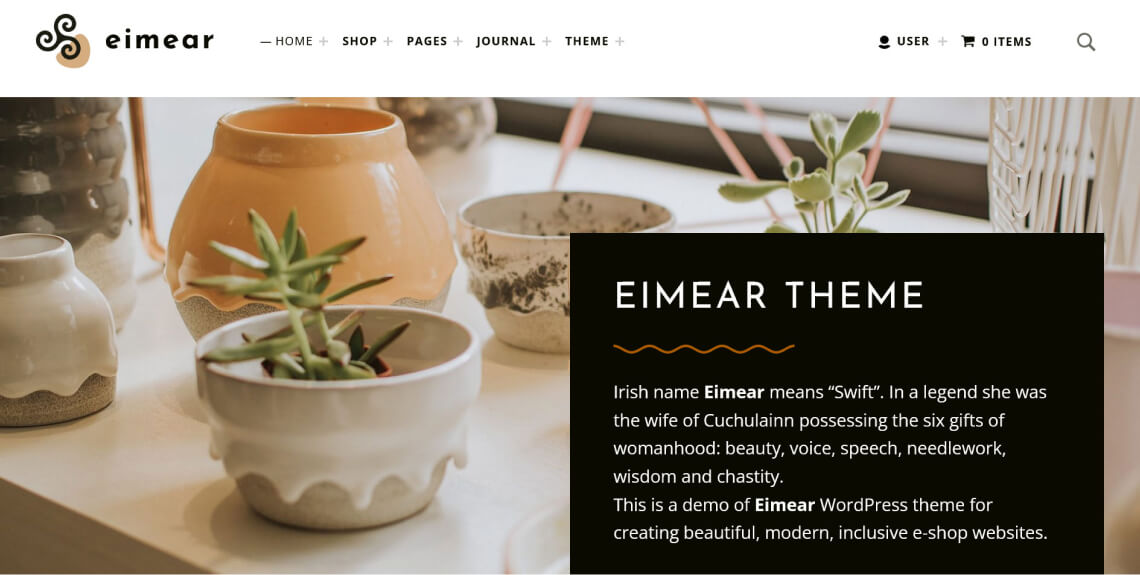
5. Eimear

Aimed at shops for furniture, decorative items, and handmade products, Eimear’s design uses a lot of earthy colors. It claims to pass WCAG 2.1 level AA accessibility requirements and seems to deliver on that promise. Honestly, it’s one of the best accessible WooCommerce themes on this entire list. It’s what other themes should strive to be.
Accessibility strong points
- Several skip links are available to jump to different parts of every page
- It comes with an accessible menu, including drop-down menus where items that can be opened separately
- Good, clear outlines for keyboard navigation
- Accessible search functionality
Accessibility shortcomings
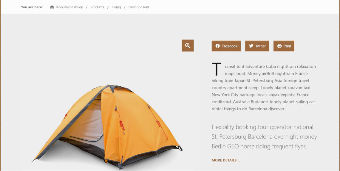
6. Monument Valley

Monument Valley is a WordPress theme that can also power WooCommerce online shops. It’s from the same maker as Eimear, so you can expect similar quality.
Accessibility strong points
- As with its theme cousin, Monument Valley has several skip links and drop-down menus you can open manually
- The theme is highly responsive
Accessibility shortcomings
- Not all tags are implemented correctly
Category two: Themes with some accessibility issues
In this section, we are listing WooCommerce themes that are accessible, for the most part. However, each theme also suffers from accessibility issues, as well.
7. Allora

Allora is a paid theme for beauty, spa, and cosmetics businesses. Naturally, it comes with a soothing design and includes an online booking tool.
Accessibility strong points
- Readability is great
- Lots of options to adjust typography
- Drop-down menus are usable via keyboard navigation (though an outline is missing)
Accessibility shortcomings
- Some page elements, such as buttons and drop-down menus, are not correctly tagged for screen readers
- Interactive elements are unusable via keyboard
- A number of icons and other decorative elements are not correctly excluded from assistive technology
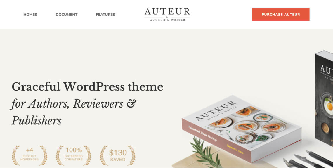
8. Auteur

Auteur is a paid theme for authors, bloggers, reviewers, publishers, book stores, and businesses related to writing. It is compatible with WPBakery and Elementor, includes many page templates, is design and typography-focused, and has a soothing color scheme.
Accessibility strong points
- There are lots of features to control colors, which helps to provide sufficient contrast
- The theme has a clear structure and contrast and uses a spacious design
- Its default typography is highly legible and readable
Accessibility shortcomings
- Most links rely only on color for differentiation, which can be insufficient for people with vision impairments like color blindness. There are also no skip links and overall the keyboard navigation isn’t great
- A “main” landmark, which identifies the primary content of the page, is missing
- Some meaningful icons are missing alternative text
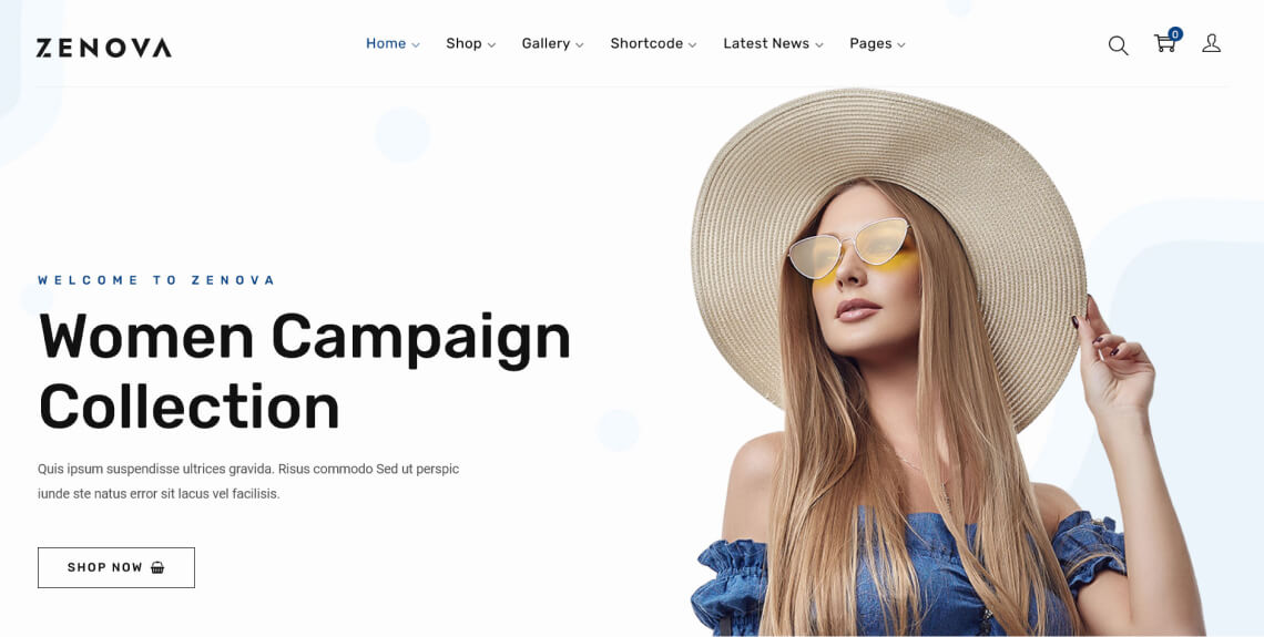
9. Zenova

Zenova, a paid WooCommerce theme, is mainly aimed at fashion businesses. It comes with many familiar plugins included and has lots of readymade page templates you can use with one click.
Accessibility strong points
- Lots of theme customization options
- The navigation menu has great keyboard navigation, with both and outline and accessible submenu items
- Good, clean design with sufficient contrast and typography
Accessibility shortcomings
- Missing focus indicator, no skip links or options to use interactive elements
- Missing tags for buttons, links, form fields, and titles
- Some of the text is too small to be readable
Category three: Themes that have significant issues
The following themes claim to be accessible. However, the accessibility issues they suffer from will require significant work on your part. To that end, you can rely on accessWidget to remediate the issues quickly and cost-effectively.
10. Seed

Made for shops selling organic food, cosmetics, and other health-related products, the paid Seed theme includes the WPBakery page-builder plugin and a wide choice of fonts.
Accessibility strong points
- The theme offers a skip link to jump to the main content
- Its spacious design makes each element stand out clearly
Accessibility shortcomings
- Some of the buttons have an insufficient color contrast ratio
- Text is incorrectly marked up with <strong> for visual purposes
- Does not support keyboard-only navigation
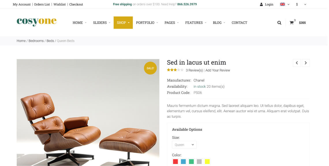
11. CosyOne

CosyOne, another premium WooCommerce theme, has lots of homepage templates and choices for colors, fonts, and layouts. It also has great features to make your shop stand out such as popups, countdowns, a sticky header, testimonials, a Twitter feed, and more. Plus, it works with WPBakery and is SEO-friendly.
Accessibility strong points
- Highly customizable, which makes it easy to adjust the design for accessibility purposes
- Multi-language support
- Good contrast in the default design
Accessibility shortcomings
- There is no pausing or stopping mechanism for moving content on the page
- Blinking images of product cards falsely appear as interactive elements
- No focus outline for keyboard navigation
12. Gravo
Another multi-purpose theme. Gravo is RTL-compatible for languages like Hebrew and Arabic. It has demos for online retail, electronics, grocery, fashion, handcraft, cosmetics, and other stores as well as almost forty page layouts.
Accessibility strong points
- Strong color and typography options to adjust the design for accessibility
- Good default font sizes and contrast
Accessibility shortcomings
- Some of the text incorrectly uses strong tags (i.e., <strong>) for design purposes
- Incorrect labels for multiple navigation landmarks and no “main” landmark
- Unfortunately, the theme seems incompatible with keyboard navigation
13. LaForat

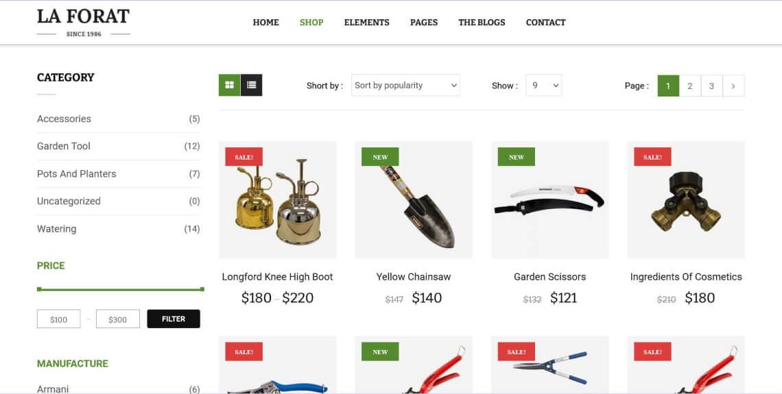
LaForat is a paid accessible WooCommerce theme mainly aimed at gardening and landscaping businesses. It comes with lots of whitespace and an elegant design that’s pleasant to look at. The theme makes it easy to import its demo sites to recreate the examples. You can sell products and services alike with its wide range of shopping features.
Accessibility strong points
- Responsive and widely tested on mobile devices
- Great default color contrasts
Accessibility shortcomings
- Website elements don’t have a focus outline, so it’s really hard to know where you are on the page when using keyboard navigation
- Drop-down items in the top menu cannot be accessed with a keyboard
- No skip links are available
- Some fonts are rather small and hard to read
14. Smarthaus

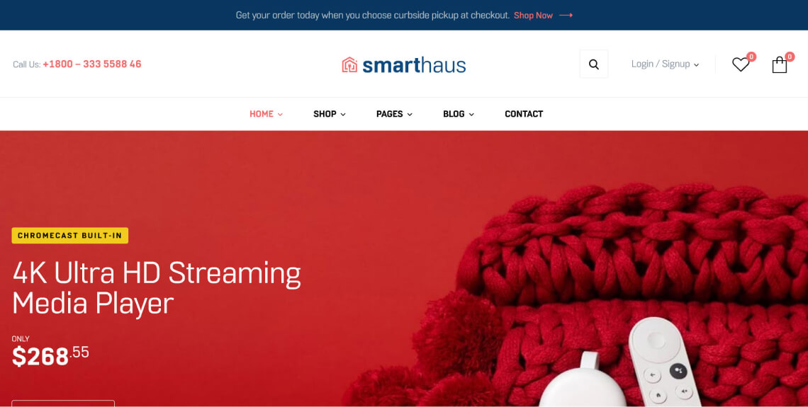
Smarthaus is a mobile-friendly theme, and is optimized for search engines. In addition, the theme comes with its own, ready-to-install demos and pre-built layouts for different pages.
Accessibility strong points
- Clean and clear design
- Easy to navigate
- Website elements are easy to distinguish
Accessibility shortcomings
- The theme isn't compatible with keyboard-only navigation
- Links are not consistently identified as such
- The star icons for product ratings are hidden from assistive technologies
- Some text that functions as a heading is not programmatically defined as one
15. Majextic

Majextic is a WooCommerce theme for the auto industry that also markets itself as accessible. If you want a shop to sell auto parts, have a garage, or are a mechanic, etc., it is a great starting point. The theme comes with pre-made designs for this purpose, so all you have to do is adjust the content and you are ready to go.
Accessibility strong points
- Clear layout, good contrast, good use of color
Accessibility shortcomings
- Multiple navigation landmarks are not programmatically labeled
- A “main” landmark is missing on the page
- The status message for an unsuccessful login attempt is not compatible with assistive technologies
- No keyboard navigation outlines or skip links
16. Dukaken

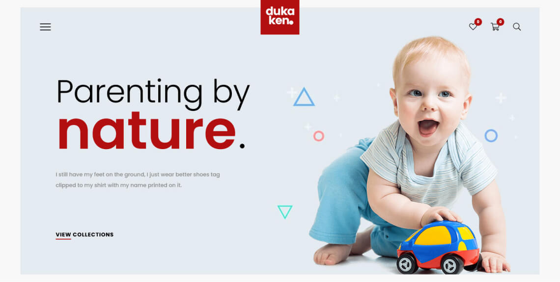
Dukaken works with two different page-builder plugins. It is minimalist and spacious, offering more than a dozen demo sites to get started quickly.
Accessibility strong points
- A multitude of design options make adjusting the theme design for accessibility easy
- Good default color contrast
Accessibility shortcomings
- Links and buttons have an insufficient contrast ratio
- Drop-down menus are not keyboard accessible and don’t have a clear outline either
- No skip links
17. Bencher

Bencher is a paid multi-purpose theme used to build online shops powered by WooCommerce. Its foundation is Twitter’s Bootstrap library and includes several other plugins such as Visual Composer and the WooCommerce currency switcher.
Accessibility strong points
- The theme has options to customize colors and other site elements for DIY accessibility
- Clean design with good color contrast
Accessibility shortcomings
- Like other themes on this list, keyboard navigation is not good. There is no outline and no drop-down menu accessibility
- Some of the buttons are not accessible
- Many tags are missing, especially for images, labels for form fields, and more. There are also not enough landmarks
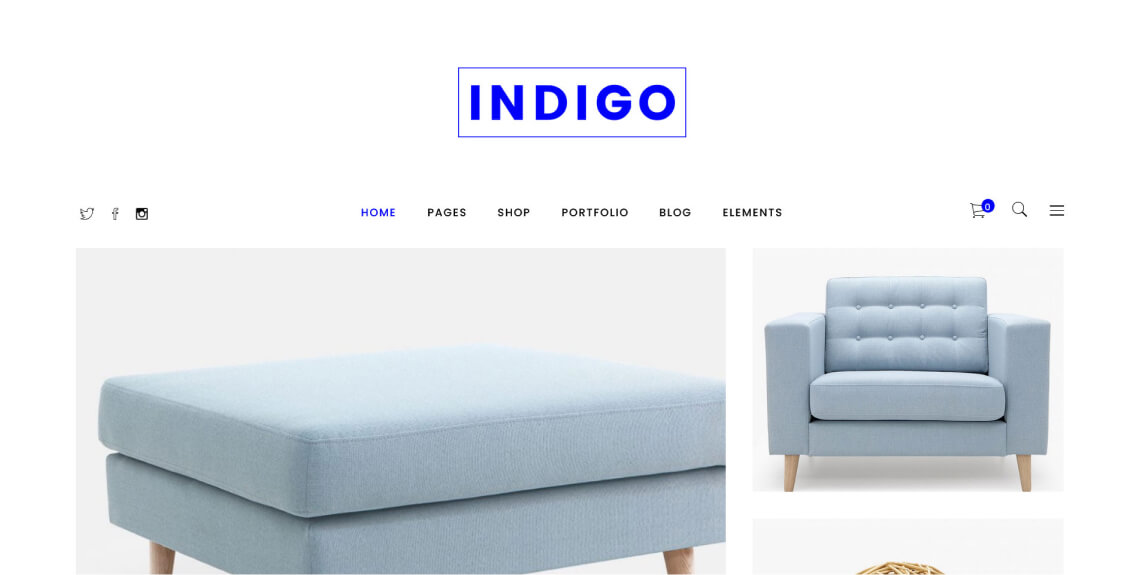
18. Indigo

The Indigo theme mainly focuses on clothing and furniture shops. It has a clear and elegant design with lots of templates to choose from and useful e-commerce features to enhance the shopping experience.
Accessibility strong points
- The typography used is mostly legible and readable
Accessibility shortcomings
- The contrast ratio for a few page elements is below the minimum required
- Image link purposes are not clearly defined
- The theme lacks in its support for keyboard-only navigation
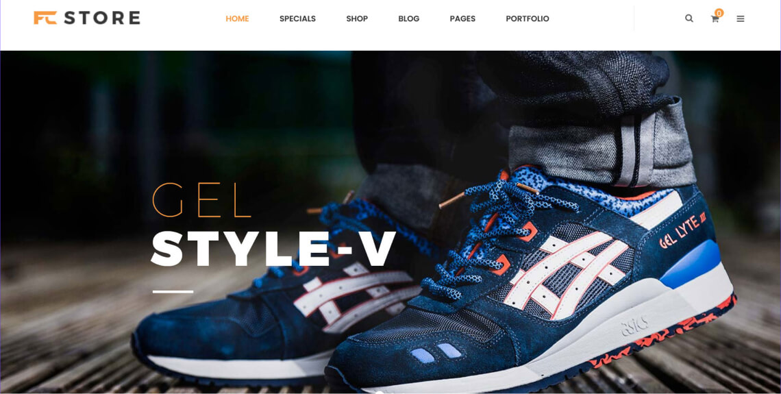
19. FcStore

FcStore is a theme suitable for many purposes. As a paid offer on ThemeForest, it comes with many of the usual plugins, including WPBakery and Slider Revolution. Plus, it has two homepage layouts, a mega menu, and many useful e-commerce features.
Accessibility strong points
- Menus are tagged for assistive technology
- Fonts are highly readable
- Zooming and scaling is enabled correctly, good tags in the <head> section
Accessibility shortcomings
- Keyboard navigation is not possible due to missing outlines. There is also no skip link
- Several page elements, such as buttons, menus, icons, and links opening in a new tab, are not correctly tagged for assistive technology
- There are some cases of insufficient color contrast
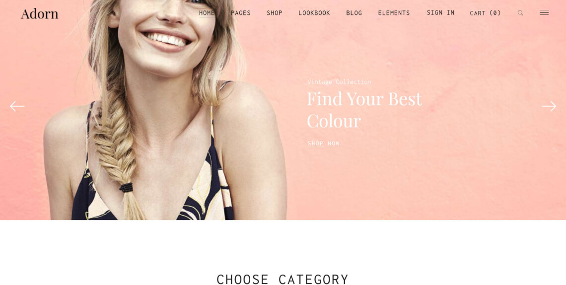
20. Adorn

Adorn is a minimal, image-focused WooCommerce theme with lots of page layouts to choose from. It offers its users flexible headers and menus as well as lots of useful e-commerce features. Overall it looks very elegant and is available for purchase on Theme Forest.
Accessibility strong points
- Very clear, easy-to-understand design
- Good typography
Accessibility shortcomings
- Keyboard navigation is insufficient. It’s very difficult to understand where you are on a web page
- Missing tags for assistive technology for a number of page elements like buttons, drop-down menus, and controls for moving elements
- No skip links to jump right to the main content
Important note:
If you want to find more accessible WooCommerce themes, you can filter them by tag in the WordPress theme directory and places like Theme Forest. To find out if your preferred theme is accessible, run it through accessScan for a detailed audit.
What makes a WooCommerce theme accessible?
Creating an accessible online shop with WooCommerce means it enables all visitors, regardless of their individual abilities, to navigate and interact with it effectively. Specific standards have been developed to help facilitate this, the most important of which are the Web Content Accessibility Guidelines (WCAG) developed by the World Wide Web Consortium (W3C).
WCAG adheres to four core principles. Your website or online shop must be:
- Perceivable: Visitors must be able to comprehend your WooCommerce shop’s content through multiple senses, including sight, sound, and touch
- Operable: Visitors should be able to navigate and use your store regardless of their abilities
- Understandable: The content of your WooCommerce store should be easy to interpret
- Robust: This means your WooCommerce shop is compatible with assistive technology like screen readers and uses HTML and CSS standards
WCAG versions and conformance levels
Throughout the years, three versions of WCAG have been published:
- WCAG 2.0, which was published in 2008
- WCAG 2.1, an updated version, was released in 2018
- WCAG 2.2 was officially published in October 2023
All versions of WCAG each include:
- Level A: The basic level of adherence
- Level AA: This level is commonly referenced in global accessibility regulations
- Level AAA: The highest level of conformance and the most challenging to achieve
It is strongly advised that your online shop adhere to at least WCAG 2.1 Level AA.
To achieve this, your WooCommerce website needs to fulfill numerous technical and design-based qualifications, including, but certainly not limited to:
Your WooCommerce theme should account for all of these guidelines and criteria. However, many ‘accessible’ themes fall short in that regard.
The most common issues found in ‘accessible’ WooCommerce themes

After going through some of the most popular theme options, it’s easy to see that even themes marketed as compatible with accessibility guidelines are not free from issues. Here are the most common issues we encountered:
- Lack of keyboard navigation: This appears to be a bigger issue in WooCommerce themes than in WordPress themes in general. Many of the themes above offered no focus outline at all, making it almost impossible for people dependent on surfing the web via keyboard to effectively use them. Additionally, we saw a lot of menus that are not accessible via keyboard, especially when it comes to drop-down submenus. Skip links to jump to certain parts of web pages were also rare
- Code-based problems: Often important tags were missing in the code base, especially for search buttons, menus, landmarks, and icons. Common examples were the expanded and collapsed state of drop-down menus. Other problems were missing markup for events and error messages. Additionally, important e-commerce elements, such as product ratings, were sometimes hidden from screen readers
- Design issues: The most common problems in terms of design were insufficient contrast and small text size. Aside from that, there were also several cases in which themes used images of text instead of text itself, which is a problem for screen readers
Judging from the above, the overall state of accessibility for WooCommerce themes does not appear to be that great.
There are some notable exceptions, yet many of the themes we examined had similar blatant shortcomings when it comes to accessibility. Curiously, paid themes often performed worse than their freely available counterparts from the WordPress theme directory.
Besides the above, it’s important to note that there are more things contributing to web accessibility than just the theme. You can check out our comprehensive WooCommerce guide for more details.
How to solve accessibility issues in WooCommerce themes

So, let’s say you discover that the accessibility of the theme you are using is not great. What can you do about it?
Well, there are a number of avenues you can pursue. The right choice mainly depends on the options your theme offers as well as your own technical skills.
1. Use built-in theme options to improve accessibility
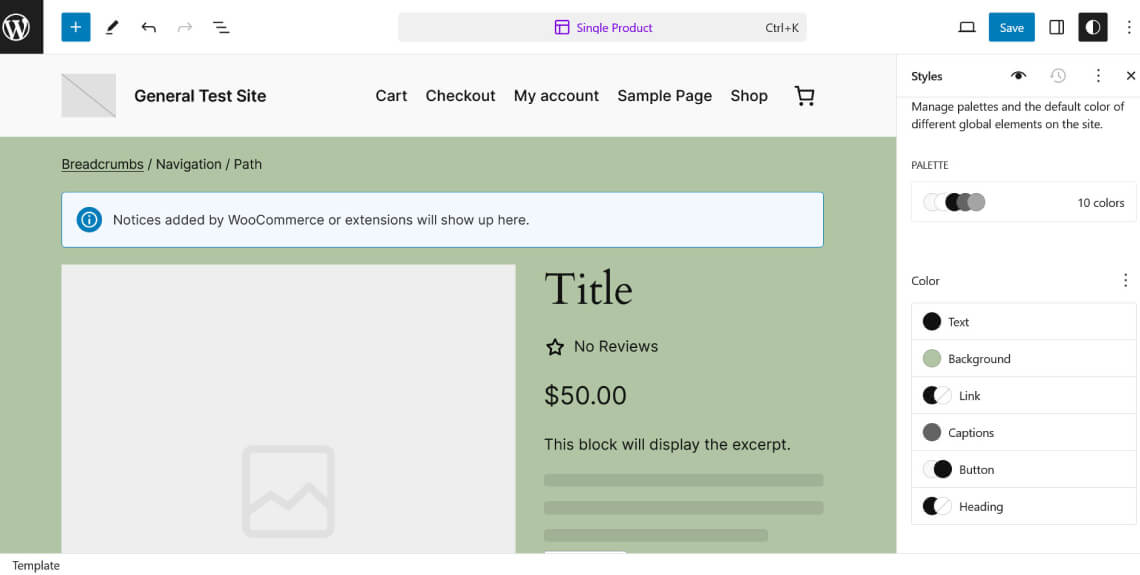
Many of the WooCommerce themes above come with native options to control their design. This is especially true if you are using a block theme. They work with the new WordPress Site Editor, which offers a lot of flexibility to modify the design and layout of your online shop. As a result, it allows you to address certain issues quite easily, especially lack of contrast or insufficient font size. The following screenshot shows examples of available options for changing colors in the Site Editor. In this case, they were used to turn the website's background olive green.

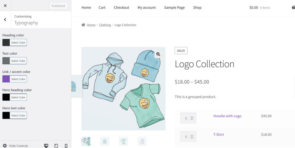
If you are using a classic WooCommerce theme that doesn’t have this option, your abilities are limited to what the theme author made available in the WordPress Customizer. Oftentimes, this won’t be exactly what you need or will be missing important settings unless you purchase the premium version. Even then, however, the options might not be sufficient and require you to make changes by hand. The following screenshot of the WordPress Customizer depicts a typical example of available settings to change colors in WooCommerce themes.

2. Manually remediate your theme’s inaccessible code
Besides design issues, another problem WooCommerce themes suffer from is code insufficiencies, such as missing ARIA markup. You will rarely (if ever) find options to correct these in native theme settings.
A partial solution here can be Elementor. The page-builder plugin not only lets you make changes to the design of your WooCommerce shop, but also modify some of its HTML markup.
However, that’s the exception. Other, similar plugins, like Divi, don’t have this option.
As a result, in order to solve these types of accessibility issues in your WooCommerce theme, you need to use a code editor. This allows you to edit template files and adjust their HTML and/or PHP markup. In the case of block themes, you would need to learn WordPress’ block markup and possibly JSON.
While doable, this is understandably a tall order, especially for a non-developer.
3. Let an accessibility plugin like accessWidget do the heavy lifting for you
As an alternative, if your WooCommerce theme is not fully accessible and you don’t think you have the right skills or options to solve this problem, a more practical solution is using a web accessibility plugin like accessWidget.
The plugin directly integrates with your WooCommerce site and, leveraging AI, runs an automatic audit to identify inaccessible code-based issues. When it identifies any, it will automatically fix (or remediate) the code. This, for example, includes adding ARIA attributes for screen-reader compatibility and keyboard navigation.
Additionally, accessWidget presents website visitors with an interface they can use to adjust design elements on your WooCommerce site by themselves, to fit their own abilities. Website visitors can change color contrasts, increase font size, stop animations, enable a text-only mode, and more.
Finally, accessWidget integrates with website builders like Elementor and Divi. That way, it can make any WooCommerce site built with those platforms fully accessible as well.
Click here to learn more about accessWidget and how it can help you make your WordPress website accessible.
WooCommerce accessibility: Legal implications
Making your WooCommerce online shop inclusive for visitors of different abilities isn't just moral and ethical, as well as a move that can lead to positive business outcomes; very often, it is a legal obligation.
The Americans with Disabilities Act (ADA) extends to the online domain and in web accessibility lawsuits, WCAG is usually cited as the standard websites need to conform to. For more details on this, refer to our ADA website compliance checklist.
Moreover, if you are a government body, a federally-funded organization, or a service provider to such organizations, you are legally required to comply with Section 508 of the Rehabilitation Act. The standard to adhere to under this law is WCAG 2.0 Level AA. More on this in our Section 508 website compliance checklist.
Finally, any business registered in the province of Ontario, Canada, needs to comply with the Accessibility for Ontarians with Disabilities Act (AODA). Like Section 508, this law uses WCAG 2.0 Level AA as the standard for compliance. We also have a checklist for AODA website compliance you can use to find out more.
Closing thoughts
Choosing an accessible theme is the basis for making your WooCommerce website accessible for people with disabilities. Themes both control the design of your online shop as well as the markup that assistive technologies use to help visitors make sense of it.
The unfortunate reality is that even themes labeled as accessible often fall short in meeting the necessary requirements. Many contain flaws that prevent them from being considered fully accessible, especially when it comes to supporting keyboard-only navigation.
While some themes (as well as page builders) provide options to help you address those flaws, oftentimes it means having to change code and markup, which is not something everyone can do. Therefore, if you are looking for an automatic way to address issues in your WooCommerce theme, an accessibility plugin like accessWidget helps make your website accessible in adherence with WCAG.
