The information presented within this guide is aimed at website owners seeking to learn the ropes of web accessibility. Technical elements are described in layman’s terms, and, as a rule, all topics pertaining to the legalities of web accessibility are presented in as simplified a manner as possible. This guide has no legal bearing, and cannot be relied on in the case of litigation.
Your website design has a profound impact on the way people perceive your brand. Featuring a well-designed website is therefore critical for virtually every business.
However, for it to provide a unique, memorable experience, your website will need to be designed with all website visitors in mind.
The best-designed websites are both visually stimulating and truly welcoming to all visitors, including to members of the disability community.
While every organization should do its part to create an accessible and beautiful website, most Ontario-based businesses are mandated by law to do so, under the Accessibility for Ontarians with Disabilities Act (AODA).
So, can you create a stunning website that incorporates modern design principles and trends while remaining inclusive to all?
We have eight examples that prove that you absolutely can.
In this blog, we’ve collected eight websites that are both aesthetically beautiful and fully compliant with the AODA. Feel free to use them as inspiration!
What is AODA compliance?
The Accessibility for Ontarians with Disabilities Act (AODA) is a law enacted in Ontario, Canada, with the intent of ending discrimination against the disability community.
The law introduces guidelines and mandates for organizations and businesses registered in Ontario, with the objective of fostering accessible environments and ensuring equal opportunities for individuals with disabilities.
The AODA applies to a wide range of organizations, including public-sector and non-profit entities, along with many Ontario-registered businesses.
Along with instructions pertaining to the removal of barriers existing within physical domains, the AODA includes clear guidelines that, when implemented, ensure the disability community can fully access online domains, most notably websites.
Web accessibility under the AODA
The AODA sets the Web Content Accessibility Guidelines (WCAG) as the standard that websites must conform to under the law. Developed by the World Wide Web Consortium (W3C), WCAG is considered by many to be the most influential set of guidelines impacting global web accessibility policy.
Throughout the years, there have been a number of WCAG iterations. Those who must comply with the AODA need to conform to WCAG 2.0, an earlier version of the most updated version of these guidelines, WCAG 2.1.
Both WCAG 2.0 and 2.1 have three levels you can conform to:
- Level A - the minimum level of conformance
- Level AA - the conformance level referenced in most accessibility laws around the world
- Level AAA - the optimal and most difficult level of conformance to achieve
The AODA sets WCAG 2.0 Level AA as its standard for compliance, and those who need to comply with this law must ensure their website meets this
.
For a deeper a dive into into WCAG, press here.
Eight examples of beautiful AODA-compliant websites
Below is a list of 9 websites that are both aesthetically stimulating and AODA-compliant. These prove that accessibility and awesome web design go hand in hand, and that companies do not have to put a cap on their creative aspirations to be accessible to every kind of website visitor.
Each of these websites has been tested by accessScan and fully conforms with WCAG 2.1 Level AA.
1. BC Non-Profit Housing Association (BCNPHA)

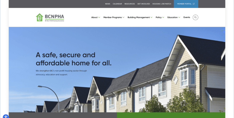
BC Non-Profit Housing Association (BCNPHA) is dedicated to providing a "safe, secure and affordable home for all," strengthening British Columbia’s non-profit housing sector through advocacy and education.
Its website leverages a green, gray, and white color scheme with text appearing in white over gray and green sections, and in black over images and white backgrounds. This elevates the website’s overall stellar accessibility status, providing a highly readable user experience to every type of visitor. Bonus points are given to its navigation menu, which appears consistently throughout the website.
2. SHAD Canada

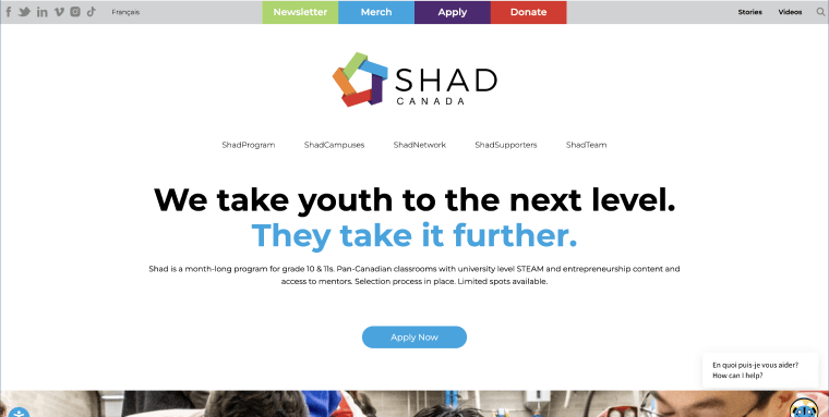
Shad Canada seeks to transform Canada's youth education sector through its enrichment and entrepreneurship programs.
For the most part, the text showcased throughout the website appears in black over a white background, a web accessibility best practice. The website also smartly presents clickable text in a large, legible font.
3. Women’s Centre of York Region

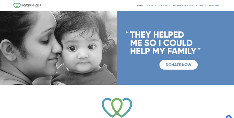
The Women's Centre of York Region (WCYR) is dedicated to "empowering women to improve their lives," providing vital services in the York Region through various programs focused on economic and emotional empowerment.
Its homepage elegantly incorporates gentle blue and white hues, with a striking, evocative image of a woman holding her baby at the top of the page.
4. Occupational Health Clinics for Ontario Workers (OHCOW)

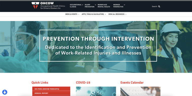
Occupational Health Clinics for Ontario Workers (OHCOW) plays a crucial role in enhancing the occupational health and safety of workers. The organization offers essential services across Ontario through its comprehensive occupational health clinics and resources.
Smart, utilitarian, and to-the-point, OHCOW’s website layout is both practical and visually pleasing. With clearly defined sections for its services, resources, clinics, and more, the organized approach reflects OHCOW's dedication to providing accessible, user-friendly resources for occupational health and safety.
5. West Coast Kids

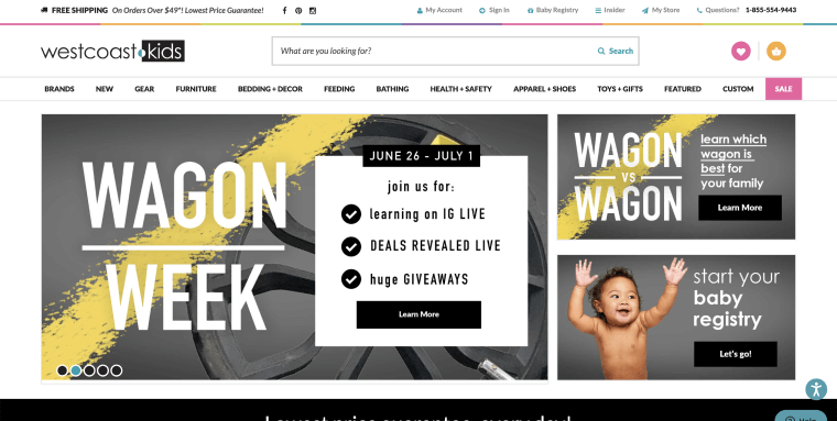
West Coast Kids is a leading provider of high-quality baby and kids products in Canada. They offer a wide range of items through their comprehensive eCommerce platform, ensuring families have access to the best products for their children. Its website features a clean and organized layout, predominantly using black text over white backgrounds, which enhances readability and accessibility.
Images of products and goods are accompanied by descriptive alt text, which is vital for people with vision impairments who rely on screen readers.
You can press here to read more about screen readers.
6. Workplace Safety & Prevention Services

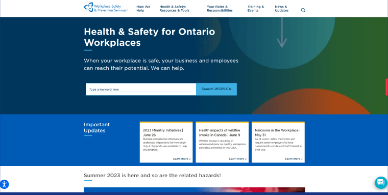
Workplace Safety & Prevention Services (WSPS) is a key player in promoting occupational health and safety in Ontario. The organization offers a broad spectrum of resources and services through their comprehensive online platform, aiming to create safer work environments across the province. A standout feature of WSPS’ website is its excellent use of descriptive anchor text for links, a web accessibility best practice. Those who rely on screen readers can click on links with a greater understanding of where they will land within the website.
7. SEO Soul

SEO Soul is a leading digital marketing agency, offering clients a wide breadth of SEO and digital marketing services. Its website features a clean and streamlined design, primarily using black text over white backgrounds, enhancing readability and accessibility. Special attention was obviously paid to the navigation menu, which features highly contrasting colors and which remains consistent throughout the website.
8. Simply Stated

Simply Stated is a distinguished digital marketing agency specializing in SEO and content marketing. Their website, with its clean layout and high-contrast text, exemplifies their commitment to creating accessible websites.
The company doesn’t just say it believes in inclusivity and fairness. It proves it, by showcasing a variety of beautiful and accessible websites it designed for clients in a designated landing page.
How can I test if my website is AODA-compliant?
You can test whether your website complies with the AODA by using automated testing tools, such as accessScan, and by turning to expert service providers, like accessServices.
To use accessScan, you will need to submit your website’s URL, after which the tool will run a quick, automated audit of your web page and check whether it conforms to WCAG 2.1 Level AA. After the audit is complete, you will be assigned a score (compliant, semi-compliant, or non-compliant), and will be given a more detailed report highlighting specific website elements that may require further attention.
accessServices can be relied on to manually audit and remediate your website, as well. Many Ontario-based organizations turn to accessServices to thoroughly examine their websites and make the necessary adjustments to ensure they achieve AODA compliance.
Both testing methods and approaches complement each other. Ontario-based organizations often rely on automated tools for an initial examination of their website’s compliance status. Once they have a more established understanding of their website’s state of accessibility, they turn to expert service providers to help examine and remediate compliance issues found during the automated test.
A more in-depth look at WCAG
WCAG is a lengthy technical document that includes numerous success criteria. However, at its core are four guiding principles:
- Perceivable: The content appearing on your website needs to be discernible through a person’s senses of sight, hearing, and touch
- Operable: Your website needs to be configured so that it can be used by individuals with motor disabilities, muscle weakness, or injuries
- Understandable: The content appearing on your website should be easy to understand. To that end, it shouldn’t contain complex jargon, and should feature information that is easy to follow
- Robust: To have a robust website, you need to consider two aspects:
- Employing clear and efficient HTML and CSS coding
- Ensuring compatibility with assistive technologies like screen readers
To fully conform to WCAG 2.0 Level AA, you will need to ensure your website meets a number of technical and design-based requirements. Notable examples of such requirements include, but certainly aren’t limited to:
- Ensuring all website functionality is operable via keyboard
- Providing text alternatives for non-text content, such as meaningful images
- Adding captions to videos
- Ensure your website is devoid of content that can induce seizures
- Applying the correct color contrast ratios between text and its background
You can use our AODA compliance checklist, which includes many of the most important action items you will need to address to conform with WCAG 2.0 Level AA.
Closing thoughts
Ensuring your website is accessible and in compliance with the Accessibility for Ontarians with Disabilities Act (AODA) is crucial for most Ontario-registered organizations. It provides people with disabilities with equal access within online environments, and is a pivotal step toward transforming Ontario into a fully-accessible province by 2025. Designing with accessibility in mind results in visually appealing and engaging websites. Regardless of industry, embracing accessibility enables the creation of memorable online experiences for all visitors.

