The information presented within this guide is aimed at website owners seeking to learn the ropes of web accessibility. Technical elements are described in layman’s terms, and, as a rule, all topics pertaining to the legalities of web accessibility are presented in as simplified a manner as possible. This guide has no legal bearing, and cannot be relied on in the case of litigation.
The way your website is designed has a deciding impact on how those who land on it will perceive you and your brand.
But a well-designed website doesn’t merely provide a stimulating, memorable experience for some website visitors, while excluding others.
Simply put, great web design provides an inclusive, accommodating environment for all website visitors, including people with disabilities.
While every organization should do its part to create an accessible and beautiful website, many businesses are mandated by law to do so, under the Americans with Disabilities Act (ADA).
And, if you were wondering, you can absolutely create an ADA-compliant website that is also visually stunning. That's why here at accessiBe, we want to make sure you know how.
In this blog, we’ve collected sixteen websites that are both fully-compliant with the ADA and aesthetically beautiful. We’ll also explore the various elements you’ll need to be aware of to ensure your website is accessible to all visitors, and show why it is so important to comply with the ADA.
What is ADA website compliance?
The Americans with Disabilities Act (ADA) is a civil rights law that protects people with disabilities from discrimination in all areas of public life. Enacted in 1990, the ADA ensures the disability community has equal employment opportunities, and equal access to goods and services.
Under ADA Title III, businesses and organizations considered ‘public accommodations’ must make their services and products accessible to people with disabilities. These include, but aren’t limited to, hospitals, hotels, real estate agencies, museums, restaurants, banks, and many small businesses.
It’s critical to note, however, that most places of business sell products and services to the public. Therefore, almost all businesses must comply with the ADA.
Today, U.S. courts apply the ADA to businesses' online domains, as well as to their physical spaces. This means that websites must be accessible to the disability community, under the ADA.
What does ADA website compliance require?
Although the Department of Justice (DOJ) has declined to adopt any official legal standard for ADA web compliance, it frequently references the Web Content Accessibility Guidelines (WCAG). Developed by the World Wide Web Consortium (W3C), WCAG is considered by many to be the most influential set of protocols impacting global web accessibility policy.
Throughout the years, there have been a number of WCAG iterations:
WCAG 2.0 was released in 2008, while WCAG 2.1, an updated version of these guidelines and the most up-to-date, was released in 2018. The first draft of the next version of these guidelines, WCAG 2.2, was initially released in February of 2020, and was officially published on October 5th of 2023.
WCAG 2.0, 2.1, and 2.2 have three levels you can conform to:
- Level A - the minimum level of conformance
- Level AA - the conformance level referenced in most accessibility laws around the world
- Level AAA - the optimal and most difficult level of conformance to achieve
WCAG 2.0 Level AA is often cited as the benchmark for website accessibility. However, to truly mitigate the chances of facing legal recourse, such as an ADA website demand letter and an ADA-related web accessibility lawsuit, websites should conform to WCAG 2.1 Level AA.
We will expand on this topic in further detail later in the blog. Press here to skip straight to that section.
16 examples of beautiful ADA-compliant websites
Below is a list of 20 websites that are both visually stunning and ADA-compliant.
These prove that accessibility and awesome web design are attached at the hip, and that brands do not have to limit their creative ambitions to be accessible to all visitors.
Each of these websites has been tested by accessScan and fully conforms to WCAG 2.1 Level AA.
1. Ultima Replenisher

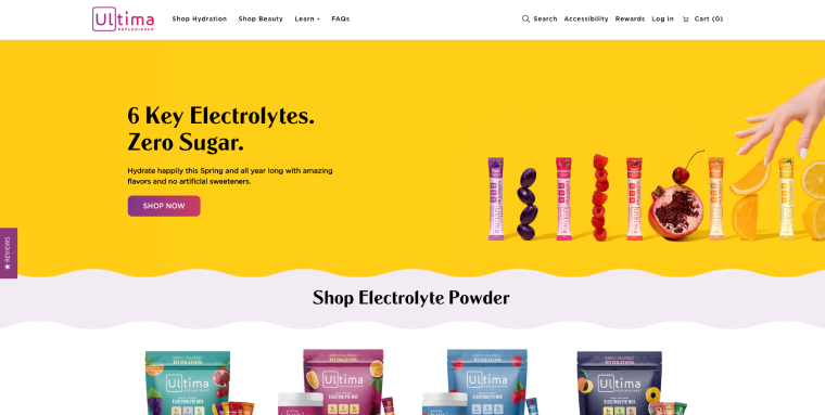
With its zero-sugar, zero-calorie electrolyte drink mix, Ultima Replenisher empowers everyone to “live their ultimate life, every day.” You can stay hydrated and healthy with flavors like peach bellini, blue raspberry, and mango pineapple.
This ADA-compliant eCommerce website incorporates a purple and white color combination, two hues that contrast in a significant and aesthetically pleasing way. Additionally, the text appearing within the website is large and sufficiently contrasts with its background.
2. Reuzel

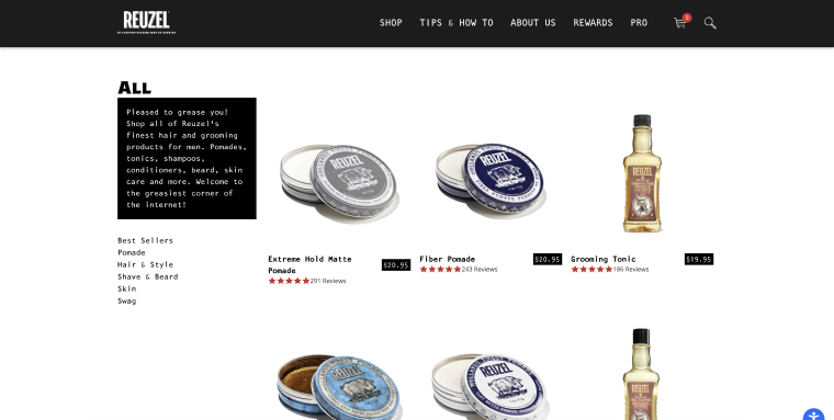
Developed by two barbers in the Netherlands, Reuzel offers a variety of grooming, skincare, and hair products. The brothers’ unique approach and quirky personalities heavily-influence the website’s design. Product images are accompanied by colorful text descriptions, often incorporating puns (e.g., pleased to grease you!)
The website relies primarily on a white and black color scheme, which is a web accessibility best practice as it allows for optimal readability.
3. Cappellos

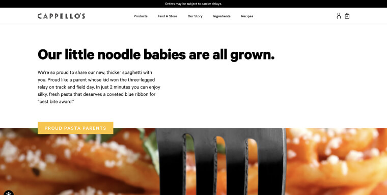
Cappello’s is reimagining pizza by offering delicious turnip-based pies made from real, simple ingredients. Its commitment to whole, non-processed foods is reflected in their extensive recipe library, which includes dozens of delicious, healthy meals that anyone can access, completely free of charge. Website visitors can increase the way the website is displayed by 200%, knowing that images and text won’t overlap or be cut off.
4. The Clear Cut

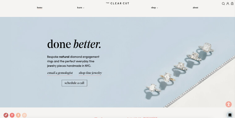
The Clear Cut is an NYC-based jeweler specializing in ethically-sourced diamond engagement rings and handmade fine jewelry. Its team of exceptional GIA Graduate Gemologists strive to make life’s special moments a little brighter through high-quality pieces that can be passed down from generation to generation.
The Clear Cut’s elegant website allows its jewelry to truly shine, displaying stunning images of earrings, necklaces, and diamonds accompanied by descriptive alt text.
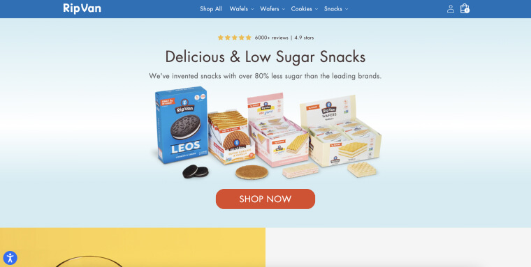
5. RipVan

RipVan specializes in designing healthier versions of some of the nation’s most beloved snacks. Their products have low sugar, high prebiotic fiber, and are devoid of artificial sweeteners and flavorings.
Images of RipVan’s not-as-sweet treats are paired with descriptive accessible alt-text, allowing visitors of all abilities to seamlessly scroll through their product offerings and find their new favorite snack. Large button text helps website visitors understand where to click next en route to a successful purchase.
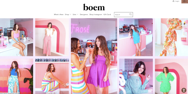
6. Boem

Founded by tastemaker Megan Orrell in 2008, Boem strives to offer an attainable, inclusive shopping experience for all women. Fourteen years later, they’ve expanded to three brick-and-mortar locations as well as an online storefront.
Despite its significant growth, this fashion boutique has held fast to their values of inclusivity. Readable font sizes, spaced lettering, and elements tagged for assistive technology create a clean experience for all website visitors.
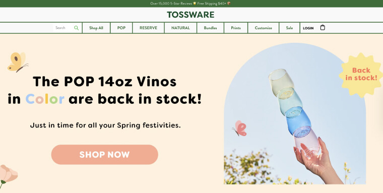
7. Tossware

Tossware has taken the stress out of fine glassware. Its line of elegant drinkware is made to be forgiving and can stand up to even the most rowdy party guest antics.
Featuring bright colors and high-contrast lines, Tossware’s website highlights the way that quality drinkware can transform your next event or quiet night at home. A wide-set, clearly labeled navigation bar leaves little room for confusion.
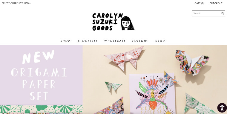
8. Carolyn Suzuki

Artist Carolyn Suzuki creates unique paper products which reflect an independent, imaginative spirit. Her playful and colorful goods shine when contrasted with a simple black and white website template. As website visitors scroll through the product list, each item is neatly spaced out, paired with large text for enhanced readability.
9. Prospect Farms

Prospect Farm’s carefully crafted line of wellness products originates on a 400-year-old property in Maine. Dedicating itself to helping build healthy communities, Prospect Farm offers a seed-to-store line of tinctures, topicals, and pet supplements.
Each organically-grown hemp product is shown in a distinct brown bottle against an off-white background. The text describing various items is highly legible, contributing to the website’s readability.
10. Twice Toothpaste

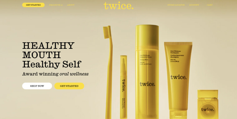
A cutting-edge oral wellness brand, Twice Toothpaste’s distinct yellow kits create a holistic oral health system to “balance mouth, body, and soul.”
Twice Toothpaste’s bright, monochromatic color scheme helps highlight its unique dental care kits, incorporating yellow photos and bold black text. This highly-contrasting color scheme helps create a highly readable user experience, a staple of accessible websites.
11. CJ Charles Jewelers

With a goal of “exceeding the extraordinary”, San Diego-based CJ Charles Jewelers carries some of the most distinguished watch and jewelry brands in the world. Its website showcases stunning hand-selected items in an aesthetically pleasing and accessible way. Elegant white space surrounds each watch image, allowing individual items' unique details to stand out.
12. M.Gemi

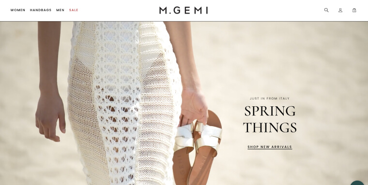
Showcasing some of the finest handcrafted leather shoes from Italian artisans, M.Gemi’s product line radiates optimism borne from the open-air fish markets and orange trees of Sicily.
M.Gemi's attention to fine craftsmanship extends to its website. Each product image stands out against a simple white backdrop. A basic navigation section makes it easy to find what you’re looking for and reflects the elegant minimalism of the company's shoes.
13. Altuzarra

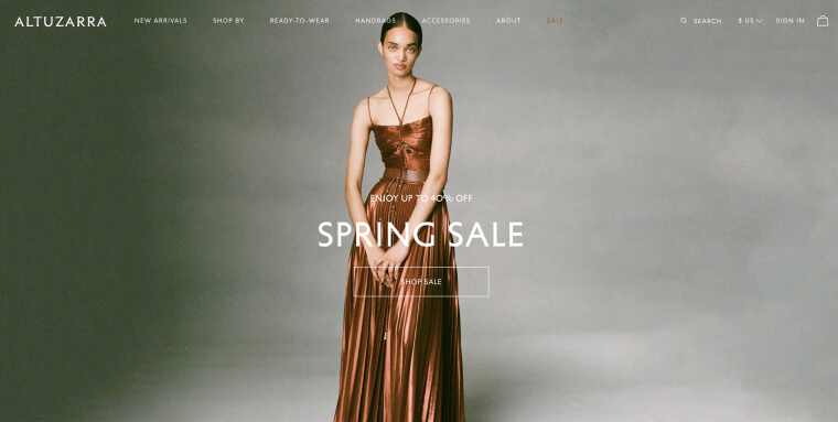
Since the launch of Altuzarra in 2008, clothing designer Joseph Altuzarra has been widely recognized as one of the most talented of his generation. His sophisticated, timeless designs reflect a unique curiosity about the world. Altuzarra’s polished website invites visitors to share in this curiosity. A simple black and white theme complements highly readable copy, allowing the dresses and other apparel featured on the website to truly shine.
14. Futuro Health

Futuro Health's mission is to help tackle one of the most pressing issues facing healthcare today: the growing workforce shortage. A nonprofit, Futuro has created one of the largest networks of allied healthcare professionals in the nation, helping connect qualified candidates with employers. Its website is sleek, with a sound navigation section and highly readable copy.
15. Hygge & West

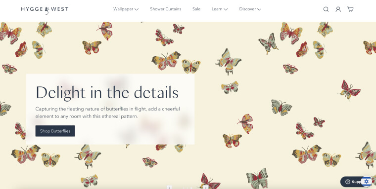
Hygge & West is a boutique wallpaper and home goods company established in 2008, by Aimee Lagos and Christiana Coop, two lifelong friends. Its goal is simple:
Creating well-designed, affordably priced, accessible wallpaper.
Incorporating dark blue text over white and pastel-colored backgrounds, Hygge & West’s website is both visually appealing and accessible to all potential customers.
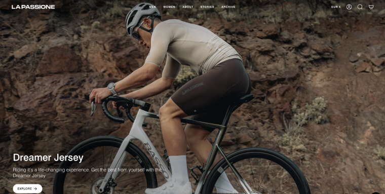
16. La Passione

A premium cycling apparel brand, La Passione offers a wide range of shorts, jerseys, jackets, and other accessories for both men and women. It’s website is sleek and modern, showcasing items in a dynamic yet easy-to navigate fashion. Item descriptions appear in black lettering over white backgrounds, contributing to the website’s overall accessibility status.
A deeper look at WCAG
Both versions of WCAG are based on four main principles:
- Perceivable: Website visitors need to perceive content presented on your website through their senses of sight, sound, and touch. To that end, your website will need to feature captions for videos, and text that can be adjusted for contrast, color, text size and spacing
- Operable: People with motor disabilities, weak muscles, and injured limbs need to be able to operate your website. To that end, your website needs to be navigable entirely by keyboard, and needs to support sight-assisted navigation, and other alternatives to a classic mouse
- Understandable: Your website needs to be easy to understand. It should be devoid of unnecessary technical terms or complex jargon, and shouldn’t feature complicated instructions that are difficult to follow
- Robust: There are two factors for a robust website:
WCAG is a lengthy document, and fully conforming to it requires making a number of technical and design changes to your website. Notable examples of such changes include, but certainly aren’t limited to:
We recommend you check out our ADA website compliance checklist, which includes many of the most important action items you will need to address to conform with WCAG 2.1.
How can I test if my website is ADA-compliant?
You can test whether your website is ADA-compliant using automated testing tools, such as accessScan, and by relying on expert service providers, like accessServices.
To use accessScan, you will need to submit your website’s URL, after which the tool will run a quick, automated audit of your web page and check whether it conforms to WCAG 2.1 Level AA. After the audit is complete, you will be assigned a score (compliant, semi-compliant, or non-compliant), and will be given a more detailed report highlighting specific website elements that may require further attention.

