The information presented within this guide is aimed at website owners seeking to learn the ropes of web accessibility. Technical elements are described in layman’s terms, and, as a rule, all topics pertaining to the legalities of web accessibility are presented in as simplified a manner as possible. This guide has no legal bearing, and cannot be relied on in the case of litigation.
People prefer to engage with well-designed websites.
However, great web design is not solely about providing a stimulating, memorable experience for some website visitors, while excluding others.
A well-designed website is one that creates an inclusive, accommodating environment for all website visitors, including people with disabilities.
While every organization should strive to create an accessible and beautiful website, certain organizations are mandated by law to do so, under Section 508 of the Rehabilitation Act.
And, if you're curious, it's entirely possible to create a website that complies with Section 508 to its fullest extent that is also visually stunning.
In this blog, we’ve collected seven examples of beautiful Section 508-compliant websites. Feel free to use them as inspiration!
What is Section 508 compliance?
Section 508 of the Rehabilitation Act of 1973 exists to ensure that members of the disability community have equal access to information and communication technology (ICT) developed, procured, maintained, or used by the federal government.
When originally enacted, Section 508 did not originally mention website accessibility. However, a 2017 amendment to Section 508 expanded the law so that it includes all types of information and communication technology (ICT), including websites.
Today, Section 508 requires all federal agencies, organizations that accept federal funding, and service providers to such organizations to make their websites accessible to people with disabilities.
What does Section 508 compliance entail?
Under Section 508, websites (along with online documents and other web-based content) must meet the Web Content Accessibility Guidelines (WCAG). Developed by the World Wide Web Consortium (W3C), WCAG is considered by many to be the most influential set of protocols impacting global web accessibility policy.
Throughout the years, there have been a number of WCAG iterations. Those who must comply with Section 508 need to conform to WCAG 2.0, an earlier version of the other updated iterations of these guidelines, WCAG 2.1. and 2.2
All three versions of WCAG have three levels you can conform to:
- Level A - the minimum level of conformance
- Level AA - the conformance level referenced in most accessibility laws around the world
- Level AAA - the optimal and most difficult level of conformance to achieve
Section 508 sets WCAG 2.0 Level AA as its standard for compliance, and those who must comply with this law must ensure their websites and other ICT conform to WCAG at this level.
We will dive deeper into WCAG and WCAG conformance later in the blog. Press here to skip straight to that section.
7 examples of beautiful Section 508-compliant websites
Without further ado, here is a list of seven websites that are both visually appealing and fully compliant with Section 508.
Each of these websites has been tested by accessScan and fully conforms with WCAG 2.1 Level AA.
1. Emerald Coast Utilities Authority (ECUA)

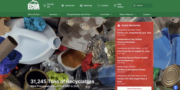
Emerald Coast Utility Authority (ECUA) is committed to enhancing the quality of life along Florida's Emerald Coast, by providing vital water, wastewater, and sanitation services. Its initiatives, most notably the Recycle Coach app and various "Live Green" programs, reflect their ongoing dedication to sustainable practices.
ECUA's website mirrors its mission, with a clean, fresh aesthetic. The chosen color palette, a soothing combination of blue and white, evokes the essence of clean, fresh water and is perfectly complemented by the bold, black text that ensures optimal readability.
2. Parmer County Texas

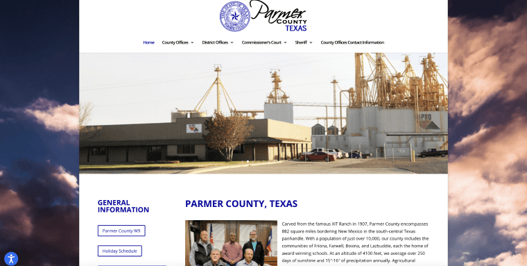
Parmer County, in the south-central Texas panhandle, borders New Mexico. Established from the historic XIT Ranch in 1907, it covers 882 square miles and hosts over 10,000 residents. Its towns include Friona, Farwell, Bovina, and Lazbuddie.
The town’s website is sleek and user-friendly, featuring a clear and straightforward design. This allows for easy navigation and access to important information about county offices. The simple layout and focus on essential details embody the county's practical approach and commitment to its residents.
3. Western Oregon University

Western Oregon University (WOU) is a public university located in Monmouth, Oregon. Established in 1856, it is the oldest institution of higher education in Oregon. The university is known for its commitment to providing affordable education and creating a supportive and inclusive learning environment for its students.
Western Oregon University’s website design is sleek, creating a welcoming effect to those who land on it. With a highly-contrasting red, white, and black color scheme, text appearing within the website really pops out, allowing for optimal readability.
4. Atlantic Cape Community College

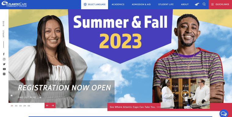
Atlantic Cape Community College (ACCC) is a public community college located in Atlantic County, New Jersey. Established in 1966, ACCC offers a variety of associate degree programs, certificate programs, and workforce development courses to help students pursue their educational and career goals.
With stimulating imagery and awesome copy, Atlantic Cape Community College’s website is bound to leave an impression on those who visit it. For the most part, text appears in black over a white background, which is the most highly-contrasting (and thus accessible) color combination out there.
5. California Mental Health Services Authority (CalMHSA)

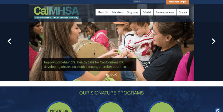
The California Mental Health Services Authority (CalMHSA) is dedicated to improving mental health and wellness across California. It is a joint-powers authority that consists of California counties working together to address mental health needs at a statewide level.
Its website manages to inspire, leveraging vivid imagery of California residents set against green and blue gradients. Its simple, intuitive navigation menu appears consistently throughout the website, contributing to its all-around stellar accessibility status.
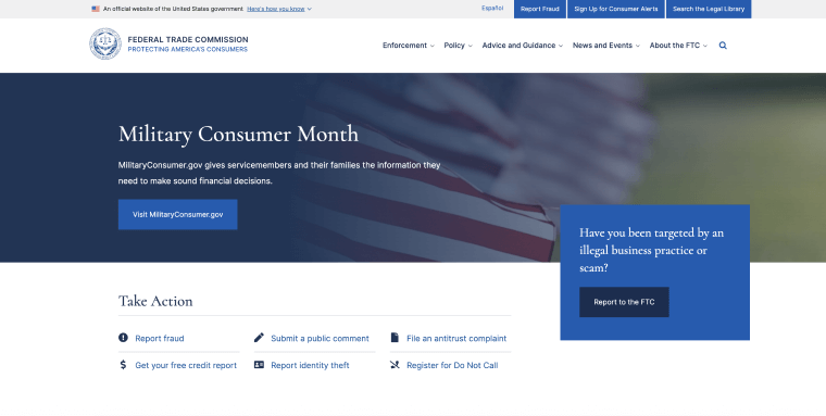
6. Federal Trade Commission

The Federal Trade Commission (FTC) is a U.S. government agency focused on protecting consumers and promoting fair competition in the marketplace. Established in 1914, the FTC enforces laws related to consumer protection, antitrust regulations, and privacy rights. The agency works to prevent deceptive and unfair business practices, investigates anticompetitive behavior, and educates the public about their rights and responsibilities as consumers.
Its website relies primarily on a dark blue and white color scheme, with text appearing in black over the white sections and in white over the blue sections. The latter, coupled with an eye-level messaging devoid of unnecessary jargon, contributes to the website’s high level of readability.
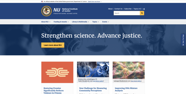
7. National Institute of Justice

The National Institute of Justice (NIJ) is the research, development, and evaluation agency of the U.S. Department of Justice. It is dedicated to advancing knowledge and scientific approaches to improve the justice system and enhance public safety. The NIJ funds and conducts research, supports training and technical assistance, and promotes the adoption of evidence-based practices to address crime and criminal justice challenges.
It would be expected of such an organization to present a website that is consistent with its worthy, important cause, from a messaging and design perspective. Even a cursory review of its website is enough to convince visitors that NIJ has succeeded at creating a website that is both beautiful and highly accessible. Thanks to highly-contrasting, evocative blends of blue, yellow, and white, the text appearing on NIJ’s website sticks out, in a good way. Additionally, link text is adequately descriptive, accommodating screen reader users.
How can I test if my website is Section 508-compliant?
You can test whether your website complies with Section 508 with automated testing tools, such as accessScan, and by relying on expert service providers, like accessServices.
To use accessScan, you will need to submit your website’s URL, after which the tool will run a quick, automated audit of your web page and check whether it conforms to WCAG 2.1 Level AA. After the audit is complete, you will be assigned a score (compliant, semi-compliant, or non-compliant), and will be given a more detailed report highlighting specific website elements that may require further attention.
accessServices can be relied on to manually audit and remediate your website, as well. Organizations rely on accessServices to thoroughly inspect their websites and make the necessary adjustments to ensure they comply with Section 508 to its fullest extent.
It is important to note that both testing approaches complement each other.
Many organizations rely on automated tools for an initial audit of their website. Then, they turn to expert service providers to help examine and remediate compliance issues found during the audit.
Finally, it is worth noting that to comply fully with Section 508, the state of your website’s conformance with WCAG 2.0 Level AA will need to be detailed in a Voluntary Product Accessibility Template (VPAT). The latter is a lengthy document that, to properly fill out, requires intimate knowledge of WCAG and considerable technical expertise. Many organizations therefore outsource the task of filling in a VPAT to expert service providers like accessServices.
A deeper look into WCAG
WCAG is a lengthy technical document, composed of numerous success criteria. However, it is built upon four guiding principles:
- Perceivable: This principle requires your web-based content to be discernible through an individual’s senses of sight, hearing, and touch
- Operable: This principle focuses on ensuring that your website is operable by individuals with motor disabilities, muscle weakness, or injuries
- Understandable: The content appearing on your website should be easy to understand. As such, it should not contain unnecessary technical terms or complex jargon, and the instructions provided should be simple and easy to follow
- Robust: To have a robust website, you need to consider two aspects: Employing clear and efficient HTML and CSS coding, and ensuring compatibility with assistive technology like screen reader tools
To fully conform to WCAG 2.0 Level AA, you will need to ensure your website meets a number of technical and design-based requirements. Notable examples of such requirements include, but certainly aren’t limited to:
- Making sure your website is compatible with screen reader tools
- Adding alt text to meaningful images
- Adding captions to videos
- Making sure text can be magnified without loss of content
- Creating interactive content that can be operated via a keyboard
- Ensuring sufficient contrast between text and its background color
You can use our Section 508 compliance checklist, which includes many of the most important action items you will need to address to conform with WCAG 2.0 Level AA.
Key takeaways
Section 508 exists to mitigate the discrimination members of the disability community face while engaging with websites. Along with fulfilling their legal obligations, organizations that comply with Section 508 (when it applies to them) do their part in creating a more inclusive, equal web. And, as it turns out, creating fully-accessible websites in no way dictates making creative compromises. Feel free to use the seven websites featured above as inspiration when creating or redesigning your website to accommodate visitors with disabilities.

