How to make your Wix website accessible: A deep dive

Creating an accessible Wix website is a multi-faceted task. There's more to it than choosing the right template or options. You also need to understand and implement key accessibility features that accommodate the unique needs of users with disabilities. Let's explore this in more detail:
Verify accessibility in Wix templates
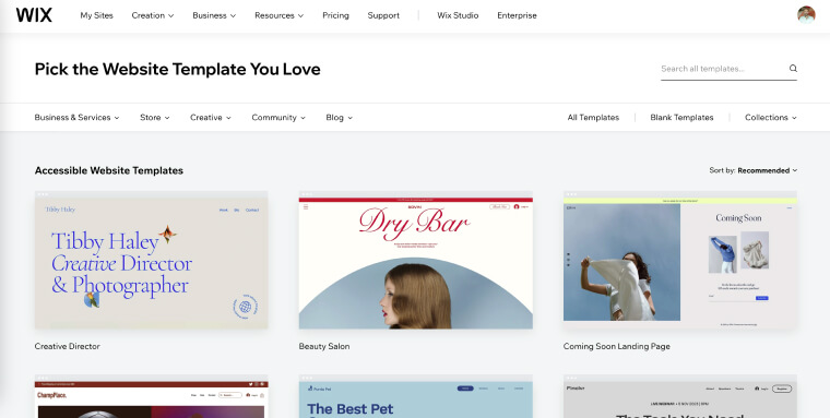
Choosing a template from Wix's accessible collection is an important first step toward creating an accessible website. You can find these templates here. But know that even these templates might not be fully accessible out of the box. Wix notes that their 'accessible' templates may not guarantee full compliance with all accessibility standards. Some advanced accessibility features, like custom ARIA labels and alt text, aren't included in these templates.

While selecting an accessible template is a good start, you'll still need to check and add elements like alt text for meaningful images, ARIA labels and roles, adequate color contrasts, and color schemes that don't rely solely on color to convey information:
- Font size: Look for templates with larger, easily readable fonts. The ideal font size should allow users to read without straining their eyes. Also, make sure the template allows people to adjust font sizes as needed
- Color contrast: A good template should have a text-to-background color contrast ratio of at least 4:5:1. This ensures your text stands out distinctly against its background, making it easier to read
- Color scheme: Using color alone to highlight links or errors in forms can be problematic for website visitors with color blindness. Instead, combine color with other indicators like underlines for links or error messages for form validations
Ensure accessibility when opting for custom Wix websites
Having Wix make a custom website for you is an option, but it's not guaranteed to be accessible. For example, let's say you decide to let Wix's Artificial Design Intelligence (ADI) tool make your site. It'll ask you a few questions about your business, the features you need, and your preferred color palette. Then, it'll create a functioning website.
The problem? This tool might not consider all accessibility requirements.
While Wix offers a range of templates and customization options to help create an accessible website, the responsibility to verify full accessibility lies with you. This involves checking aspects we will detail next, like color contrast, font size, navigation, and the correct use of ARIA attributes.
Use appropriate headings
Headings are the framework for web content, much like chapter titles and subheadings in a book. They're more than just visual elements — they're textual elements that define your web page's sections and subsections.
Effective use of HTML tags for headings is imperative for making your Wix website accessible and easy to navigate. Here's why:
- They enhance structure and clarity: Headings (H1, H2, H3, etc.) are like signposts that guide users through your content, providing a clear structure. They organize information in a digestible manner, making it especially helpful for people with cognitive disabilities
- They assist screen reader users: Users relying on screen readers use headings to quickly understand the page layout and jump to the sections they're interested in. Incorrect or missing headings can leave users disoriented
- They offer SEO benefits: Search engines use headings to understand and index your website's content. Properly structured headings improve your site's search engine ranking
- They help ensure consistent design across your site: Beyond accessibility, headings contribute to a uniform and readable design — breaking text into manageable sections
Remember to start with a H1 tag for your main title and only use it once within a given page. Then, use subsequent tags (H2, H3, etc.) in a sequential order for subheadings. Avoid skipping levels to maintain clarity for assistive technologies and all users.
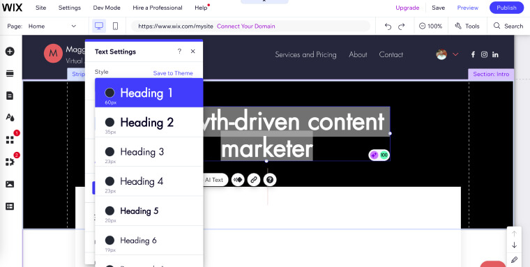
Here's what adjusting headings looks like within the Wix editor. You can reach this area by highlighting a section of text, and then clicking on the 'Style' drop-down menu:

Add alt text for meaningful images
Meaningful images on your website need alt text. Added as an HTML tag, alt text is read aloud by screen readers, describing the content and purpose of an image to users. It is important that the alt text adequately describes what appears in a given image, while remaining concise. It is recommended to keep alt text between 80 and 100 characters long.
There are several ways to add alt text to meaningful images in Wix:
- In the Wix Editor: Use the Settings panel to add alt text for single images. For galleries, add alt text through the Media Manager
- In Wix ADI: Add alt text to images via the media settings panel. For galleries, use the Media Manager
- Using the Accessibility Wizard: First, navigate to 'Settings' and select 'Accessibility Wizard.' Then, click 'Scan My Site' and choose the 'Alternative Text' cards for images. Finally, enter the image description and click 'Set Alt Text'
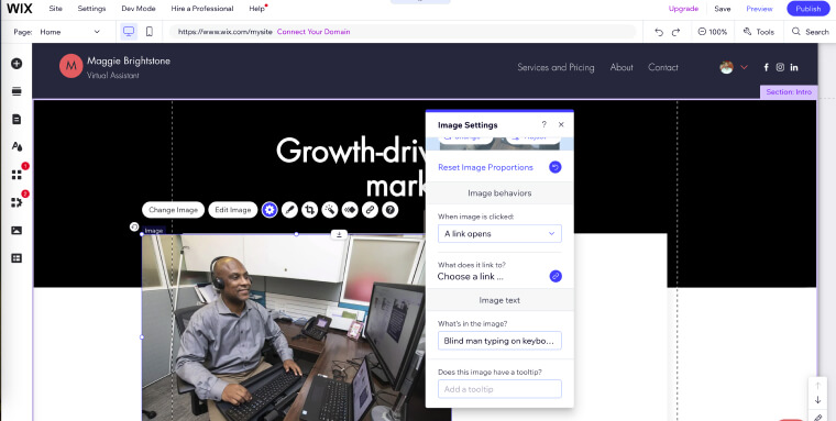
Here's what adding alt text in Wix looks like by using the first approach. Note that the path taken to reach this window was right-clicking on the image itself and selecting 'Settings'.

It is important to note that, unlike meaningful images, decorative images (i.e., images that do not convey critical information germane to the topic at hand) should be hidden from assistive technology.
To that end, you need to ensure these images do not feature alt text. You can then mark these images as decorative, so that screen readers can skip over them.
To mark images as ‘decorative’ in Wix, you can follow these steps:
- In the Editor, access 'Settings' and then 'Accessibility Wizard'
- Select the option 'Scan my Site'
- In the 'Alternative Text' section, click the checkbox that says 'This image is decorative, it doesn't need a description'
Add descriptive metadata
Descriptive metadata is like a website's introduction. It's made of HTML code elements like meta tags. These describe what's on a webpage, helping to convey your content to search engines and screen reader users.
You'll see this information in two main places:
- Titles: These are the main headings you see in search engine results or in the browser tabs. They give a quick idea of what the page is about
- Meta descriptions: These are the short summaries under the titles in search results. They tell you more about the page's content
Metadata is critical for accessibility. As screen readers access a webpage, they read the meta title aloud, offering a clear idea of the page's topic. Screen reader users can then gauge whether the page they are accessing is truly relevant to them.
Pro tip: Meta descriptions should be between 150-160 characters long. You can use this Character Counter to see how long your meta description is.
How to add metadata in Wix:
In Wix, adding descriptive metadata is a straightforward process done in the SEO settings of each page. Access these settings in the Wix Editor, where you can improve accessibility by adding titles, descriptions, and other metadata. While it's not possible to delete default meta tags that Wix adds to your website, you can modify, hide, or delete additional meta tags.
For a complete walkthrough on adding these elements to your Wix site, refer to the detailed instructions on Wix's support page.
Use clear fonts
When picking fonts for your Wix website, go with familiar and easily readable fonts. Factors to consider when choosing an accessible font include:
- Size: Ensure the font is big enough for all website visitors to read your content
- Weight: Light fonts can be hard to read, but overly bold fonts can be overwhelming — so pick something in the middle
- Style: Recognizable and simple fonts are usually best for accessibility; avoid script fonts as they can be challenging for those with dyslexia or low vision to interpret
Popular accessible fonts include:
- Arial
- Calibri
- Century Gothic
- Helvetica
- Tahoma
- Verdana
Remember: There's no definitive "most accessible" font. It can vary based on your audience's needs. Larger font sizes or increased line spacing might help some users digest information. Testing and feedback are key to finding the best fit.
Read our comprehensive guide on choosing accessible fonts for your website.
Select contrasting colors
High contrast between text and its background makes it easier for people with low vision to access your content. This applies to all elements, including buttons, links, and interactive features.
WCAG 2.1 Level AA guidelines point to a contrast ratio of at least 4:5:1 for normal text and 3:1 for large text.
Opt for bolder contrasts like dark text on light backgrounds. Consistently applying high-contrast schemes throughout your site not only improves usability for people with disabilities but also improves the overall user experience. Consider these high-contrast color combinations for website accessibility:
- Black or dark blue and white: These classic combinations offer maximum contrast
- Blue and yellow: These colors contrast well, but be mindful of specific shades that might not work together
- Red and white: While red can be tricky, it contrasts sharply with white — suitable for text and graphics. Choose the right shade of red for optimal contrast
Be wary of common low-contrast pairings, such as red and green or blue and purple, which can be problematic for color perception.
Pro tip: Tools like WebAIM's Contrast Checker and Adobe's Contrast Checker are useful for testing and verifying color combinations.
Go about motion economically
Moving elements can affect visitors with cognitive conditions like motion sickness, epilepsy, or ADHD. To that end, you should:
- Avoid or limit autoplay: Autoplay in videos and music can interfere with screen readers, making it difficult for users to digest your site's content
- Avoid parallax scrolling: This technique, where background and foreground move at different speeds, can cause navigation and accessibility challenges
- Reduce motion support: If your site uses autoplay for animations or videos, visitors should be able to pause or stop the auto-playing content
- Avoid flashing content: Web pages should not contain anything that flashes more than three times in one second
Make sure your forms are accessible
Your online forms should be easy to navigate and understand for all users, including those with disabilities.
Here's how you make your forms accessible:
- Proper labeling: Clear and properly coded labels will help screen reader users understand and navigate your form fields
- Keyboard navigability: Making all form elements accessible via a keyboard helps users with motor impairments who can't use a mouse
- Error identification: Provide clear error messages that help users correct mistakes. These should be easy to understand and guide the user to the problem area
- Logical structure: Arrange form elements in a logical order to help users comprehend the flow of information
- Feedback confirmation: Include confirmation messages upon successful form submission to let people know you've received their input
Wix's no-code platform offers intuitive tools and templates to simplify this process. This means you don't need deep technical skills to create accessible forms. When using Wix, you can easily add descriptive labels, structure forms logically, and make all form elements keyboard-friendly. Implementing these features is vital for accommodating all visitors, making your website inclusive and compliant with accessibility standards. You can read more about that process by pressing here.
Add captions and transcripts for videos
Many Wix users feature videos on their websites to show their offerings and explain how they work. When embedding videos from platforms like YouTube or Vimeo, add captions and transcripts to bring your content to life. Captions are text descriptions on the screen that explain a video's sounds and dialogue. They're essential for those who can't hear the audio. To that end, you need to:
- Ensure accuracy because even small errors can shift your content's meaning entirely
- Account for dialogue and non-speech information like significant sounds
- Sync them with the audio to deliver a smooth viewing experience
For transcripts, describe all visual and auditory elements in sequence, including:
- Non-verbal cues like facial expressions or gestures to add context
- Key visuals like important scenes and character actions
- Scene changes to maintain the storyline flow
You can use a transcription service or software to embed transcripts for users who need them.
Important note: If you're using auto-generated captions, don't forget to manually review them. Automated systems can miss nuances, misinterpret words, or omit crucial sound descriptions. This leads to misunderstandings or incomplete information for those relying on captions. To learn more about video accessibility, you can press here.
Use descriptive anchor text
Anchor text is the clickable text in a hyperlink, telling users where the link leads. To ensure they are accessible, you should adhere to the following list of action items:
- Be specific and informative: Instead of generic phrases like "click here," use text that describes the link's destination. A good example is, "Read our detailed guide on web accessibility"
- Provide context: Anchor texts should have substantial context about the linked content. This helps users, especially those using screen readers, understand what to expect before clicking
- Be brief but clear: Keep anchor texts concise and easy to understand. Avoid lengthy descriptions but ensure they're informative enough
- Avoid ambiguity: Each anchor text should be distinct to prevent confusion
Descriptive anchor texts not only enhance user experience but also improve SEO. They help search engines understand the content, contributing to greater website visibility.
Make sure your online documents are accessible
Wix websites often feature various online documents, such as PDF guides. Making these documents accessible involves a process called document remediation. This process entails, but isn't limited to, the following elements:
- Ensuring sufficient text-background color contrast
- Adjusting elements for screen reader accessibility
- Adding alt text to meaningful images
- Ensuring a logical reading order
The process of remediating online documents can prove tedious and time-consuming. That's why many turn to expert service providers like accessServices for complex remediation projects. Leaning on experts with deep knowledge of web accessibility guidelines proves beneficial, especially when dealing with lengthy documents. They handle everything efficiently so you save time and money.
Click here to learn how accessServices can simplify your document remediation efforts.
It's worth noting that interactive elements like e-signatures require accessibility accommodations. For people with disabilities, offering alternative methods like voice recognition or signature stamps goes a long way toward inclusive access.
Apply ARIA attributes
ARIA attributes define ways to make web content and web applications more accessible, especially for people using screen readers. They provide additional context or descriptions for elements on the page, such as a button's role or the status of dynamic content updates.
Incorporating ARIA attributes in Wix involves adding specific code to your site elements. This process helps screen-reader users understand and navigate your site more effectively.
Some Wix templates come with built-in ARIA attributes. Customizing your site might require adding specific attributes for enhanced accessibility. But if your site doesn't have custom elements, you won't need to modify ARIA attributes. For detailed guidance on adding these to custom web applications in Wix, visit Wix Support.
Integrate with a web accessibility tool
As mentioned above, Wix’s accessibility features can prove very helpful in your efforts to make your website accessible to all visitors, regardless of ability. However, they cannot be relied on exclusively if your goal is ensuring your website is fully accessible. Some templates branded as ‘accessible’ will lack critical accessibility components. This is especially true in regards to missing or inappropriately applied ARIA labels, critical for screen-reader users. Without the proper technical know-how, it is very difficult to identify areas that require additional attention, and to perform these remediation tasks manually.
This problem becomes even more glaring any time you update your website. Additions and modifications to your website invariably introduce new accessibility issues that must be addressed. Doing so manually is simply too demanding a task for most SMB website owners.
Ultimately, to ensure optimal accessibility, you will need to integrate your Wix website with an accessibility tool, like accessWidget.
Once installed on your website, accessWidget, accessiBe’s flagship web accessibility tool, audits your website’s code, searching for problematic areas, such as missing ARIA labels. Once these are identified, accessWidget will automatically remediate the code, ensuring your Wix website is accessible.
accessWidget also provides your website visitors with an interface through which they can configure design and UI elements to fit their unique needs. These include stopping animations, adjusting color contrasts and font sizes, and enabling a text-only mode.
Click here to learn more about how accessWidget can make your Wix website fully accessible.
What does having an accessible Wix website mean?
An accessible Wix website is one that all visitors, including those with disabilities, can navigate and interact with effectively. To achieve this, your Wix site needs to adhere to established web accessibility standards. These standards include specific guidelines that, when followed, ensure that your Wix website is configured and designed to provide a fair and equitable browsing experience for members of the various disability communities.
The most important set of web accessibility guidelines are the Website Content Accessibility Guidelines (WCAG). Created by the World Wide Web Consortium (W3C) – a prominent body that spearheads many important web accessibility initiatives – WCAG is widely regarded as the most important web accessibility standards in the world today. WCAG is also instrumental in shaping web accessibility policies, a topic we will expand on later in the blog.
Despite being a long and complex document, WCAG’s numerous sections (or success criteria) are ultimately based on four fundamental principles:
- Perceivable: Website visitors should be able to perceive content appearing on your Wix website through their senses of sound, sight, and touch. To that end, captions should be added to videos and text alternatives (alt-text) should be added to meaningful images
- Operable: Website visitors need to be able to operate your Wix website regardless of ability. An operable Wix website is one that can be navigated entirely by a keyboard, sight-assisted navigation, and other alternatives to a classic mouse
- Understandable: Your Wix site needs to be easy to understand. Its layout should be simple and predictable, menus and other repeated components featured within it should appear consistently throughout the entire website, and the default language of a given web page needs to be set
- Robust: For your Wix website to be robust, it needs to use HTML and CSS according to specification, and be compatible with assistive tools that people with disabilities use to browse online
The three versions and conformance levels of WCAG
Throughout the years, there have been three iterations of WCAG iterations:
- WCAG 2.0 was released in 2008
- WCAG 2.1, an updated version of these guidelines and was released in 2018
- WCAG 2.2, which was officially published in October of 2023
Each version of WCAG offers new and dynamic techniques that enhance the user experience for people with specific disabilities.
Within each of these WCAG versions, you can conform to one of three different levels:
- Level A - the lowest level of conformance
- Level AA - the conformance level referenced in most accessibility regulations around the world
- Level AAA - the most difficult (and thus, the optimal) level of conformance
It is recommended that your Wix website conforms to WCAG 2.1 (or 2.2) Level AA.
What does conforming to WCAG 2.1 Level AA entail?
Conforming to WCAG 2.1 Level AA requires that your Wix website meets a number of technical and design-based requirements. These include, but certainly aren’t limited to:
- Compatibility with screen reader technology like JAWS and NVDA
- Keyboard-only navigation
- Mobile-responsive design
- Proper color contrasts between text and its background
- Captions for meaningful video content
- Accessible online documents
- The option to resize text without losing out on functionality
What does Wix offer in terms of accessibility?
Wix stands out with robust features designed to ensure inclusivity for all visitors. Built with accessibility in mind, Wix incorporates these key elements:
- Full keyboard functionality: Wix makes every element operable via a keyboard, from simple buttons to more complex elements, like checkout forms on online stores. This feature is critical for those who rely on keyboard navigation due to certain impairments (namely motor impairments) or personal preferences
- Automatic DOM order: The Document Object Model (DOM) of Wix websites is structured in a way that facilitates seamless navigation for keyboard and screen-reader users. This arrangement respects the natural top-to-bottom, left-to-right reading order, making site navigation easier
- Site language definition: Wix automatically renders your site in the correct language. This means screen readers can accurately interpret and convey your content to users with vision impairments
- Correct semantics: Website elements like buttons, links, and forms are labeled and organized in a way that is optimized for assistive technologies. As a result, people with disabilities can better understand and interact with your content
- Smart focus ring To help keyboard users, Wix implements smart focus rings. These rings appear around the currently selected element and have dual, significantly contrasting colors for enhanced visibility. Website visitors who can't use a mouse can still navigate with ease
- ARIA attributes Built-in ARIA attributes provide detailed descriptions of elements and actions, making the user experience richer and more accessible. Wix also allows for custom ARIA attributes on apps and components you build. This means you get more control over accessibility. ARIA is a more technical element of web accessibility, which you can read about in greater detail by pressing here
- Skip to content feature: This feature allows keyboard users to bypass navigation menus and other repeated components to directly access the main content of a page. A skip-to content link helps people get to the content they need right away
Wix's Accessibility Wizard
Along with the features listed above, Wix provides a helpful Accessibility Wizard to guide you through making your website more inclusive for all visitors. It works within the Wix Editor to scan your website and identify areas for improvement.
After opening the Wizard, you can start by scanning your site. This scan identifies common accessibility issues, like missing alt text or insufficient color contrast. From there, you can review and address them. Following the scan, the Wizard provides a clear, step-by-step guide to help you fix these issues.
Key features of the Accessibility Wizard include:
- Site scanning: Automatically scans your website to detect accessibility issues, such as missing alt text for meaningful images or low color contrast
- Contrast checking: Helps you check and adjust text and background color contrast to improve readability
- Guided issue resolution: Offers step-by-step guidance to fix identified issues and make your website more accessible
- Customization and adjustment: Includes a 'Find and Fix Issues' section for further adjustments, and encourages adding an accessibility statement to demonstrate your commitment to inclusivity
For more detailed instructions and guidance, refer to Wix's support page here.
Important note: Wix’s accessibility tools and features can help you identify critical elements that require remediation and attention. However, by Wix’s own admission, they cannot be relied on to create a truly accessible website. To ensure your Wix website is fully accessible, you will ultimately need to rely on an accessibility tool, such as accessWidget.
How to test your Wix website’s accessibility level

You can test whether your Wix website is accessible by using automated testing tools, such as accessScan, and by relying on expert service providers, like accessServices.
To use accessScan, you will need to submit your Wix website’s URL, after which the tool will begin a quick, automated testing process of your web page and check whether it conforms to WCAG 2.1 Level AA. After the audit is complete, you will be presented with detailed results that will help you address website elements that are non-accessible (if any exist).
accessServices can be relied on to manually audit and remediate your Wix website, as well. In general, Wix websites are more complex in nature and require a more in-depth audit to determine if they accommodate all visitors. Many Wix website owners often rely on accessServices to thoroughly inspect their online stores and make the necessary adjustments to ensure they are fully accessible.
It’s important to note that both approaches complement each other.
Many Wix website owners rely on automated tools for an initial audit of their online store, and then turn to expert service providers to help examine and remediate accessibility issues.
Why making your Wix website is critically important

More than a quarter of adult Americans live with some form of disability. Members of the various disability communities are often discriminated against, and are denied access to digital environments that others can freely engage with. Ensuring that people with disabilities are presented with a fair and equitable online experience is our moral responsibility.
It is worth noting that members of the various disability communities command trillions of dollars in disposable income. When your Wix website is accessible, you allow people with disabilities to browse your goods and services, and potentially spend their hard-earned money on your offerings.
Web accessibility legal obligations
You may be legally mandated to ensure your Wix website is accessible to people with disabilities if you operate in the U.S., Canada, or the European Union.
It is generally accepted that the Americans with Disabilities Act (ADA) applies to the online domain, as well as to businesses’ physical structures. Many U.S. courts today apply this law to websites, and often reference WCAG as the standard that should be met under the ADA. This is consistent with the Department of Justice’s reference of WCAG as being the standard websites should conform to under the ADA.
Another leading piece of anti-discriminatory American legislation that includes instructions regarding web accessibility is Section 508 of the Rehabilitation Act. Section 508 applies to governmental bodies, federally-funded organizations, and service providers to such organizations, and points to WCAG 2.0 Level AA as its standard for compliance. Relevant bodies must ensure their websites and other information and communication technology (ICT), such as videos, PDFs, and email, to name a few, conform to WCAG at that level.
Ontario-registered businesses need to comply with the Accessibility for Ontarians with Disabilities Act (AODA). Under this law, your Wix website must conform to WCAG 2.0 Level AA.
To learn more about complying with these laws, we recommend you check out these resources:
Closing thoughts
Wix is a fantastic platform, allowing you to create stunning websites quickly and easily. However, if you are not conscious of them when creating your site, people with disabilities are likely to find it difficult (if not downright impossible) to properly access and navigate your Wix website. It is critical that you follow the tips listed in this blog, and take the necessary steps to ensure your website (along with the online documents appearing within it) conforms to WCAG. Finally, by integrating with a third party web accessibility tool such as accessWidget, you can achieve optimal accessibility, empowering individual visitors to configure your Wix website so that it fits their own unique abilities.
