Find your answers here!
How can I customize my installation?
accessWidget is designed to be ready to go, so all you need to do is paste the code into your website. This means that accessWidget’s default options have been carefully selected to best suit your needs and those of your site visitors.
You can also choose to customize accessWidget so it reflects your brand and preferences.
Before customizing, make sure the widget is already installed on your website. See our Website Onboarding Guide for instructions.
How to customize your installation
1. On the accessiBe homepage, select Login in the top right corner, and log in to your account.
2. Select a license.
3. Select Install and customize widget.
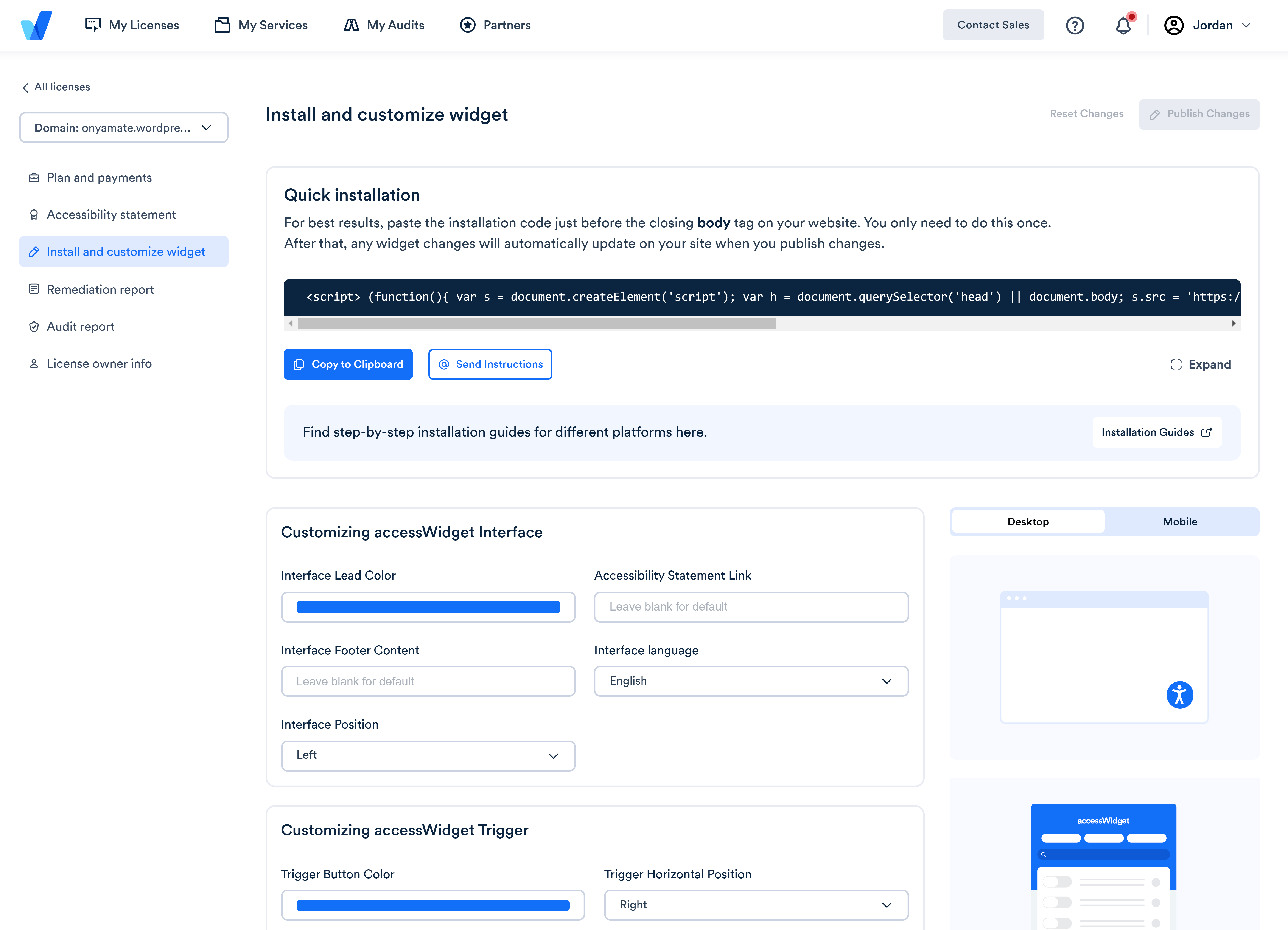
3. Under Customized Installation > Customizing accessWidget Interface set the following:
- Interface lead color - the main color used in the widget interface. The default color is accessiBe blue.
- Interface footer content - type text to appear in the widget footer to present your brand/company or leave blank
- Interface position - choose the position on the screen where you want to place the widget
- Accessibility statement link - type the link to display your own accessibility statement or leave blank for the default accessiBe statement.
- Interface language - select the widget display language. The default language is English.
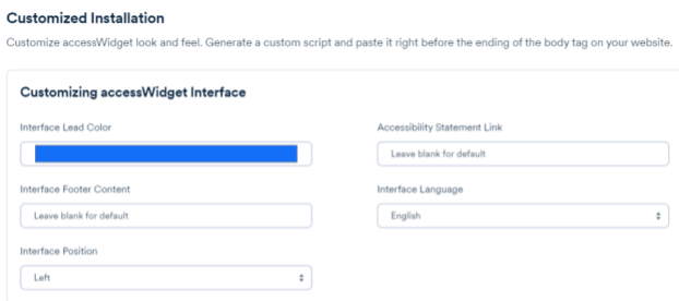
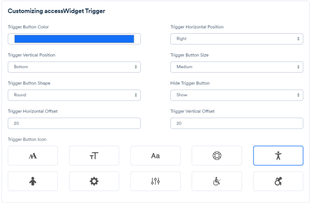
4. The trigger is the accessibility button on your website that opens accessWidget for your users. Under Customizing accessWidget Trigger set the following:
- Trigger button color - set the color of the accessibility button that is used to open the interface. The default color is accessiBe blue.
- Trigger vertical position - select the vertical position of the accessibility button. The default is bottom.
- Trigger button shape - select the shape of the accessibility button. The default is round.
- Trigger horizontal offset - set the horizontal offset of the accessibility button from the edge of the screen. The default is 20.
- Trigger horizontal position - select the horizontal position of the accessibility button. The default is right.
- Trigger button size - select the size of the accessibility button. The default is small.
Show/hide trigger button - show/hide the accessibility button. The default is show. - Trigger vertical offset - set the vertical offset of the accessibility button from the edge of the screen. The default is 20.
- Trigger button icon - select an icon to represent the accessibility button
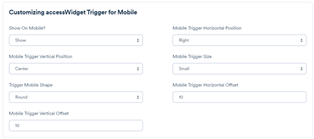
5. Under Customizing accessWidget Trigger for Mobile set the following:
- Show/hide trigger button on mobile - show/hide the accessibility button on mobile
- Mobile trigger vertical position - select the vertical position of the accessibility button. The default is center.
- Mobile trigger shape - select the shape of the accessibility button. The default is square.
- Mobile trigger vertical offset - set the vertical offset of the accessibility button from the edge of the screen on mobile. The default is 0.
- Mobile trigger horizontal position - select the horizontal position of the accessibility button. The default is right.
- Mobile trigger button size - select the size of the accessibility button on mobile. The default is small.
- Mobile trigger horizontal offset - set the horizontal offset of the accessibility button from the edge of the screen on mobile. The default is 0.
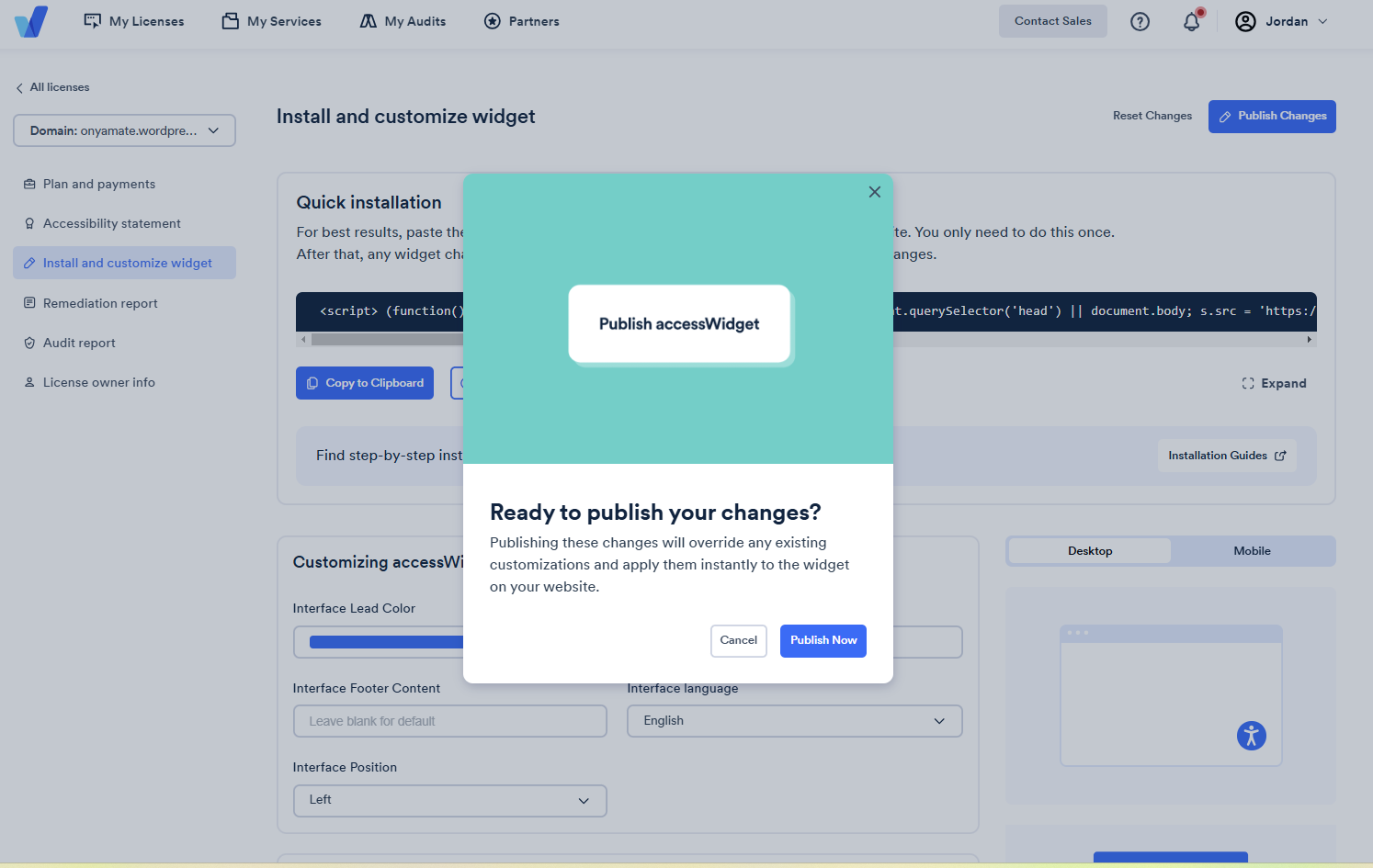
6. Once you have finished customizing, select Publish Changes.

7. In the popup window select Publish Now. This will override any existing customizations and instantly apply the changes to your site.
